Updating error screens to improve the UX and feedback.
- Scope: Text
- Role: Text
- Tools: Text
- Collaborators: Text
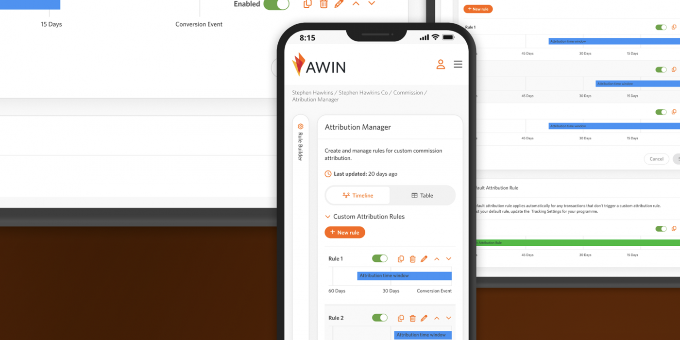
Welcome screen for the Attribution Manager
Existing Product & Problem
We had a variety of different error screens and feedback messages, however, the error screens weren’t informative, nor did they follow any style or allow a user to navigate to other pages.
Process
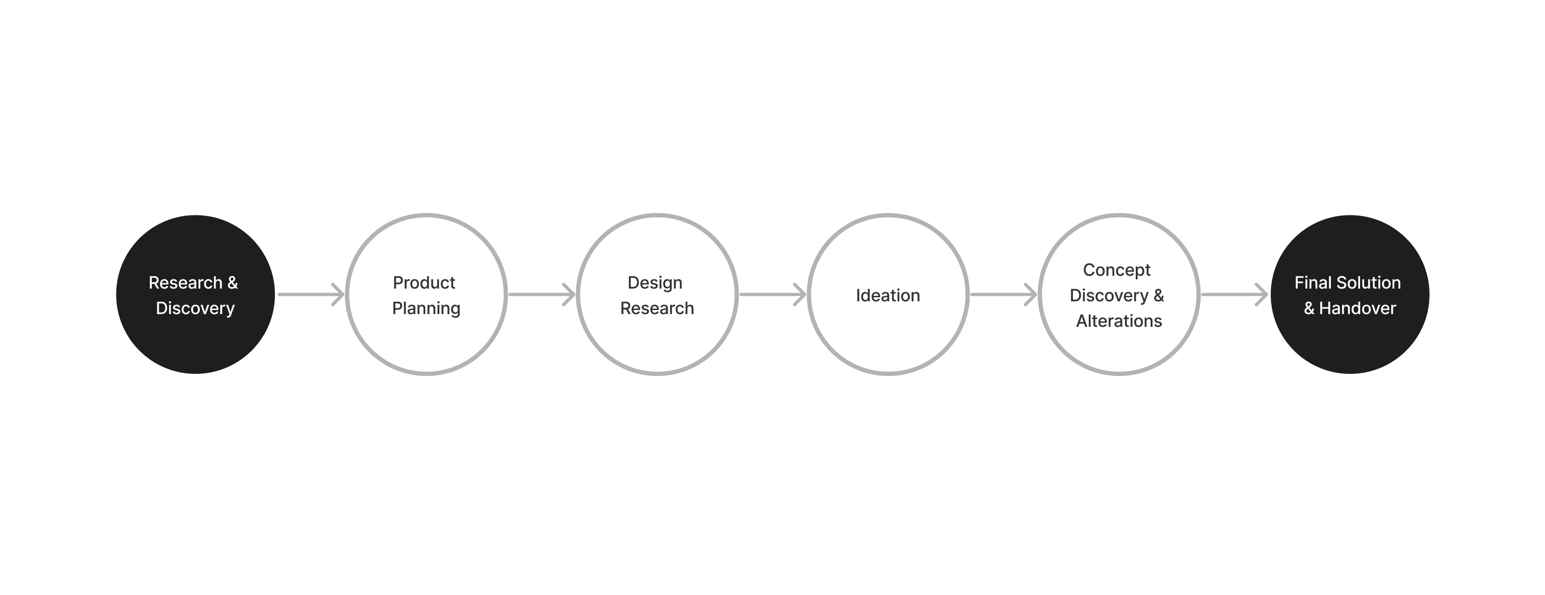
Research & Discovery
I look into screens I had saved, errors I had noticed from watching user recordings when they issued a problem. I talked with engineers and the design team to understand the current structure. I looked into common patterns for 404, and 500 pages.
Concerns
We didn’t have a record of all errors within the system, and most of the errors were not localised.
Ideation
I presented my idea at first to update the error pages. I presented basic wireframes and to stakeholders and then worked on the wording. I asked the design team what library we used for illustrations and as nothing was decided, working with them we chose libraries we would like to use and how they could be used, as on the app we would use them sparingly. I then put forward ideas in English and Japanese, to show what style we could go with before the 404 and 500 pages were developed and implemented by the engineers.
Solution
We were ablate implement some of the error pages and translate them into English and Japanese. We also made sure the errors looked right on mobile.
Future Vision
I would like to know about all errors. Also to update contrasting colour as many messages had low contrast feedback messages, where any message/feedback must be visible and understandable by users.
Key Takeaways
I designed the idea for desktop, but the Japanese team also wanted to know how it would look on mobile. I only put the idea forward, but even working with the design team meant I had to make the content work on mobile. It was also interesting to learn what was known about errors, and how it had been missed.