The old website needed a revamp.
- Scope: Text
- Role: Text
- Tools: Text
- Collaborators: Text
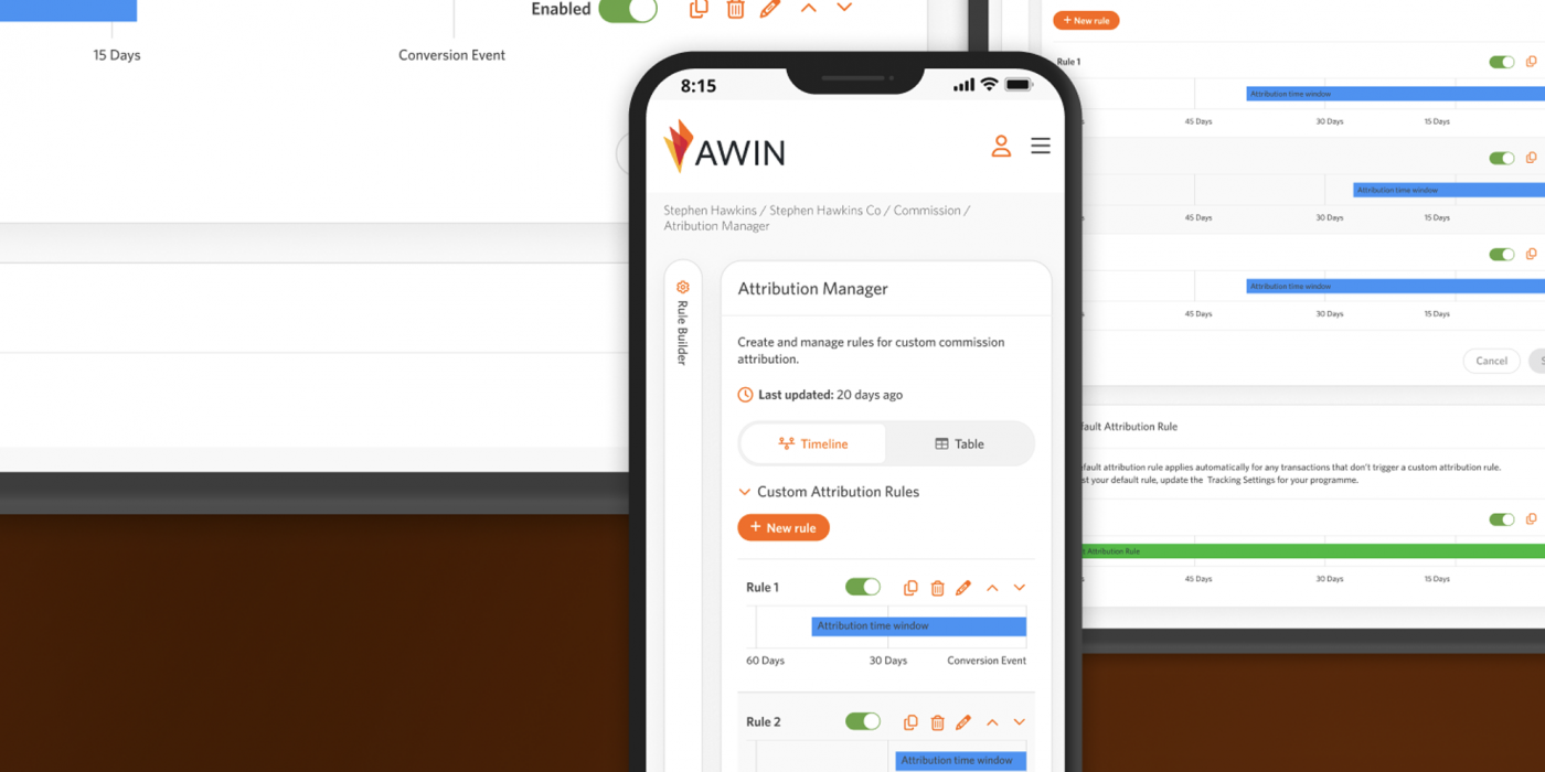
Welcome screen for the Attribution Manager
Existing Product & Problem
The websites content was outdated and the website design felt old as well, so a fresh new look was much needed,
Process
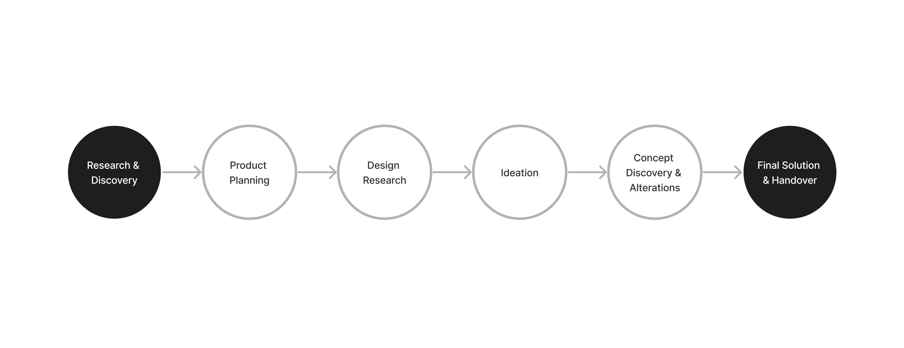
Research & Discovery
I looked at our groups websites and what content we needed, I then asked our business side in Malaysia & Japan what content they needed and what would be impotant for them for sales. I looked at other competitors and marketing companies to get an idea of what style was needed.
Concerns
I had no real brief for what was needed and I had to create the content at first, so I wondered how much help I could get as I didn’t know what style they would want for the website if they wanted something new or a more corporate feel.
Ideation
I started off with making a new website design based on our current website for the Japanese marketing side. I then created a new look that was corporate, but when showing I to stakeholders they wanted a more modern marketing vibe. I got told to make something that would “pop” and try something in a gen-z which got me thinking of what style they wanted to go for and what would work in Malaysia and for clients in the APAC region. I cam up with four different styles, so that I could show these before moving forward with a design style.
Solution
The final design had a modern style, clearly showsed the information and with my UX knowledge I also tried to make sure content would be easily accessible to find and easier for users to reach out and get more information. The website used bright vibrant colours to give in a fun and friendly feel.
Future Vision
I would want to also update the sales material as it has a completely different style.
Key Takeaways
Working without any real direction at first was difficult, especially for a part of the company I didn’t have much knowledge about. But in the end I was ablate deliver something that expressed what the brand does and it looks nice overall.