Users weren’t finding the information they needed about becoming a publisher which we felt needed iprovement
- Scope: Text
- Role: Text
- Tools: Text
- Collaborators: Text
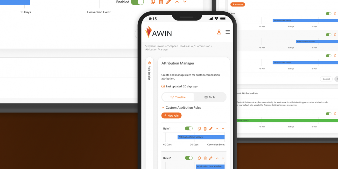
Welcome screen for the Attribution Manager
Existing Product & Problem
Users were just going straight to the publisher login, and most people weren’t viewing the publisher page due to the lack of content and how well the page content was laid out, so we wanted to make sure people would find the information they need.
Process
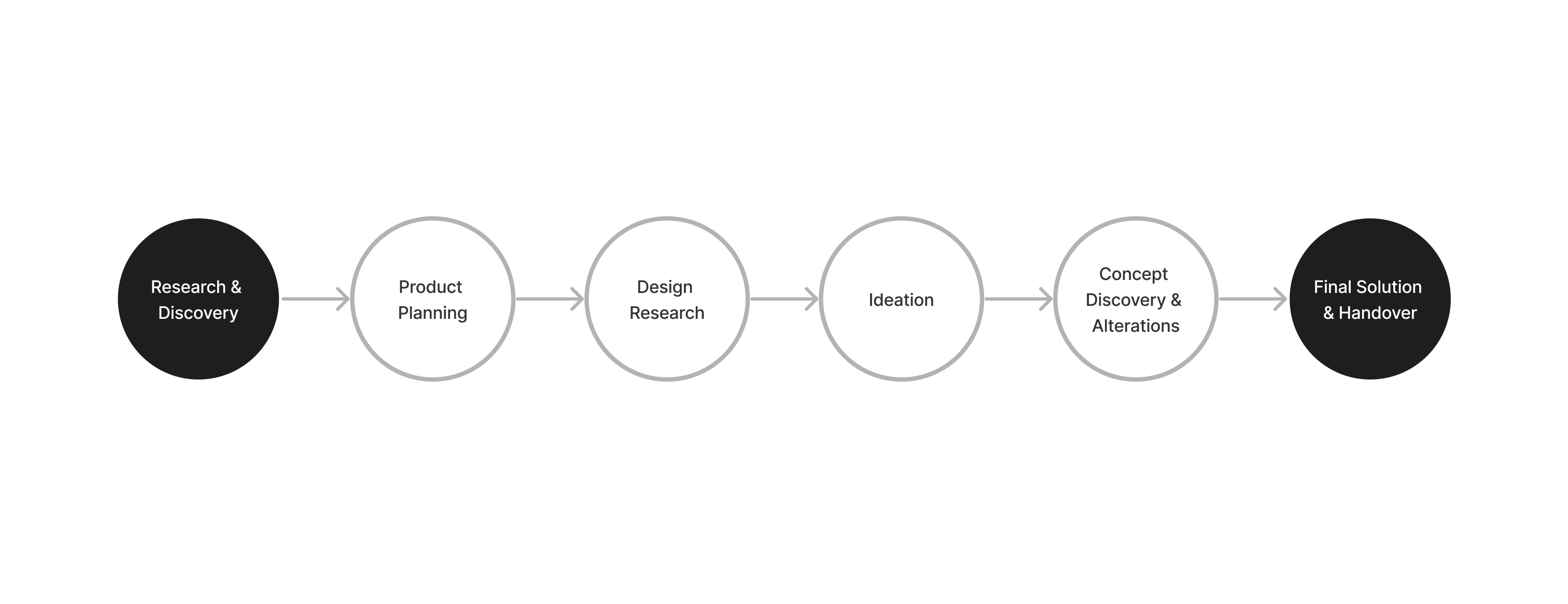
Research & Discovery
Working with a Japanese designer we worked together looking at different anyltics such as Hotjar and GA4 to understand how users were using the website and what areas we felt were missisng. I also held hearings with Accont Managers to understand our different users and did some user research to understand our users, as our users were in the APAC region and Japan. It was interesting working with a designer that was new to UX, and how he found some data that I wasn’t able to see due to language differences , so it was good to come away with more learning about how different users found the process of onboarding from the homepage via the publisher page, or even when they bypassed it. We could see that only the top half of the page was being seen and many CTA areas were not visible. One thing we learned was that nothing explained the overall process and why they should sign up.
Concerns
With many users to the website from different locations and with. Different languages I was concerned that the content would need to be localised, but due to timings it seems not posible to try different layouts.
Ideation
We looked at different examples of publisher information from competitor websites in different regions, such as the APAC, EMEA and Japan competitors. I also looked at other SaaS companies such as Hubpot etc and how the content is delivered to them. I then put together ideas for page content and what illustrations we should use. I then delivered these ideas to stakeholders, and worked with the designer and other designers to put the page together. One thing Inoticed that I had to explain every decision to other people/designers viewing the content, even though they weren’t the end desired user.
Solution
The page was released with a layout that flowed and explained the process of what happens when you onboard a a publisher, and why with key areas during the explanation with CTAs to get a user to where they need to be. We were able to improve the onboarding and make it easier for new publishers to join the platform.
Future Vision
I would have liked to include some sort of chat to help encourage users or someway to make it even easier for them to register. I learned that users in Thailand don’t like to fill out large forms and they usually need more guides, so to make it easier for them I wondered if having some sort of chatbot might be useful. I would also like to change sections around depending on localisation as the content doesn’t always work in the same flow for other localities.
Key Takeaways
Designing for multiple types of users and languages requires a lot of different thought. It was nice to work with someone that was new to UX and seeing what they could find using a different mind set.
Learning from my colleagues In the APAC taught me that not one way works for all users.