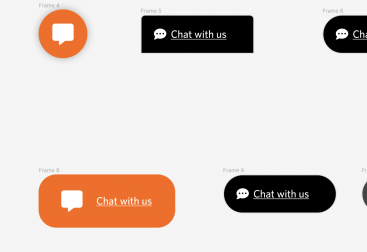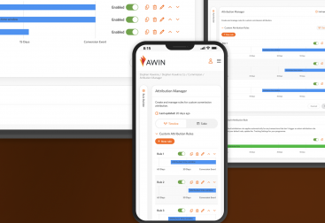
To improve how users could reach out to get support from within the app.
- Scope: Text
- Role: Text
- Tools: Text
- Collaborators: Text
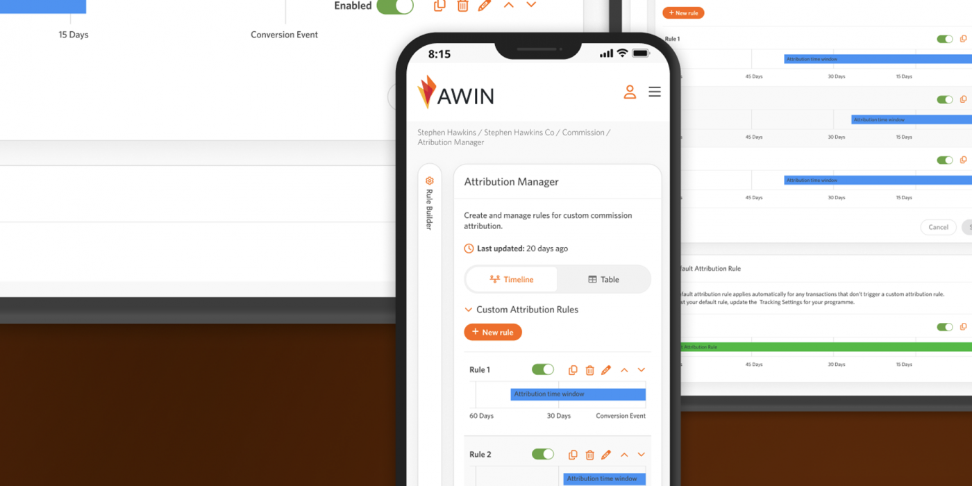
Welcome screen for the Attribution Manager
Existing Product & Problem
Within the app if a user clicked on contact this would then open up an email and in some cases take the user off site. The email might also come with no context or information for certain departments, as either types of users could message.
Process
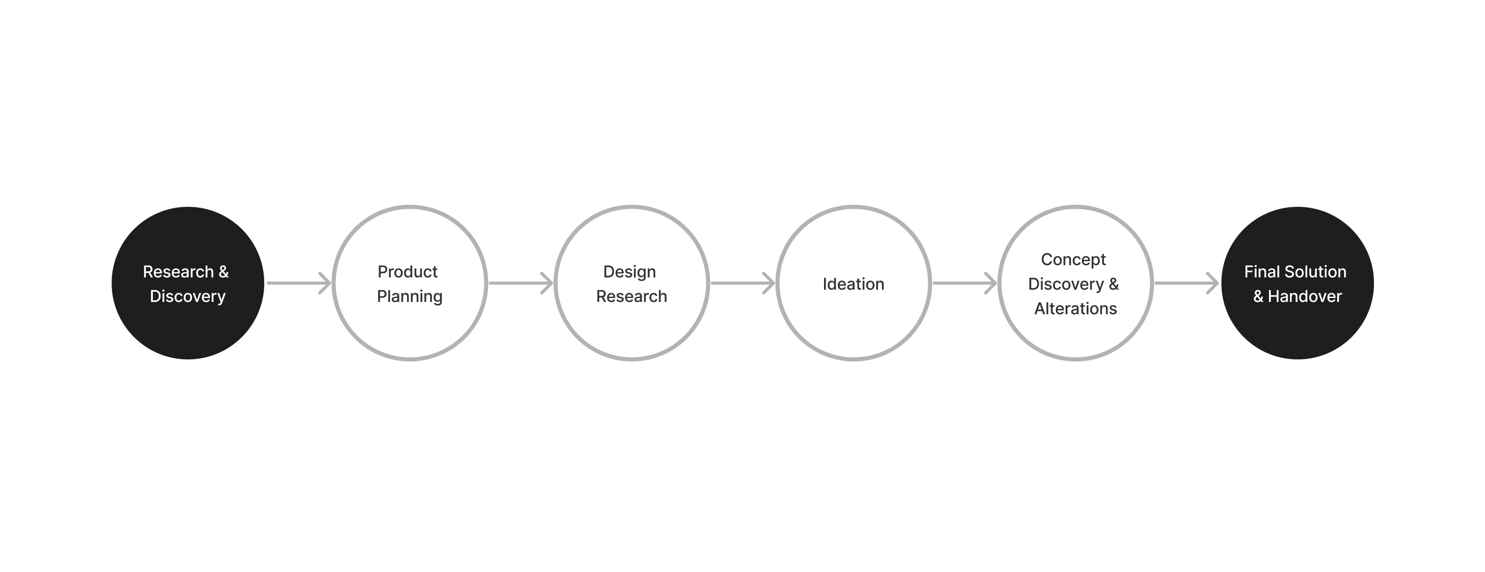
Research & Discovery
I looked at all the examples of contact forms we had on the website and also at what sort of messages we had received already from clients.
I mapped out the flow from a users perspective and what the current process was for receiving emails from users from the website.
Concerns
We had no system for separating different types of users, nor anyway for users to receive a notification of they contact. We also needed a way to separate messages so that they would go to the right area when language is used.
We also didn’t have any HTML emails, so all emails came through as plain text.
Ideation
I looked at other competitors and other websites in the same global and Japan affiliate fields. I then mapped out the flow for receiving emails and what subjects we could use, so emails could be directed to the right support team so we could help a user asap.
Solution
Two forms were creating for our two user types with different subjects so they could go to the right support/cotnact person. For Japanes users we also included a confirmation screen as this is common UX in Japan. We noticed that more people reached out using the contact forms and we were able to direct messages to the right departments.
Future Vision
I would like to connect it to a chatbot or an agent so that clients could contact us at all times. As the contact forms were within the app, we would be able to get information about them easily and help them with whatever issue they might have.
Key Takeaways
Understanding how different users from different countries use the website was important, as well s understanding the original process of how emails were received and collected. Working wit ht the Japanese team was interesting as we had to adopt UX differences for Japanese users, such as the confirmation page which is common in Japanese contact UX. In the end we were able to help users reach out easily.