We migrated a feature enabling customers to set and manage rules for commission payouts.
- Scope: Research & Concept Design
- Role: Research, Concept Design & Visual Identity
- Tools: Figma & Figjam
- Collaborators: Stakeholders, Content Designer & Development Team
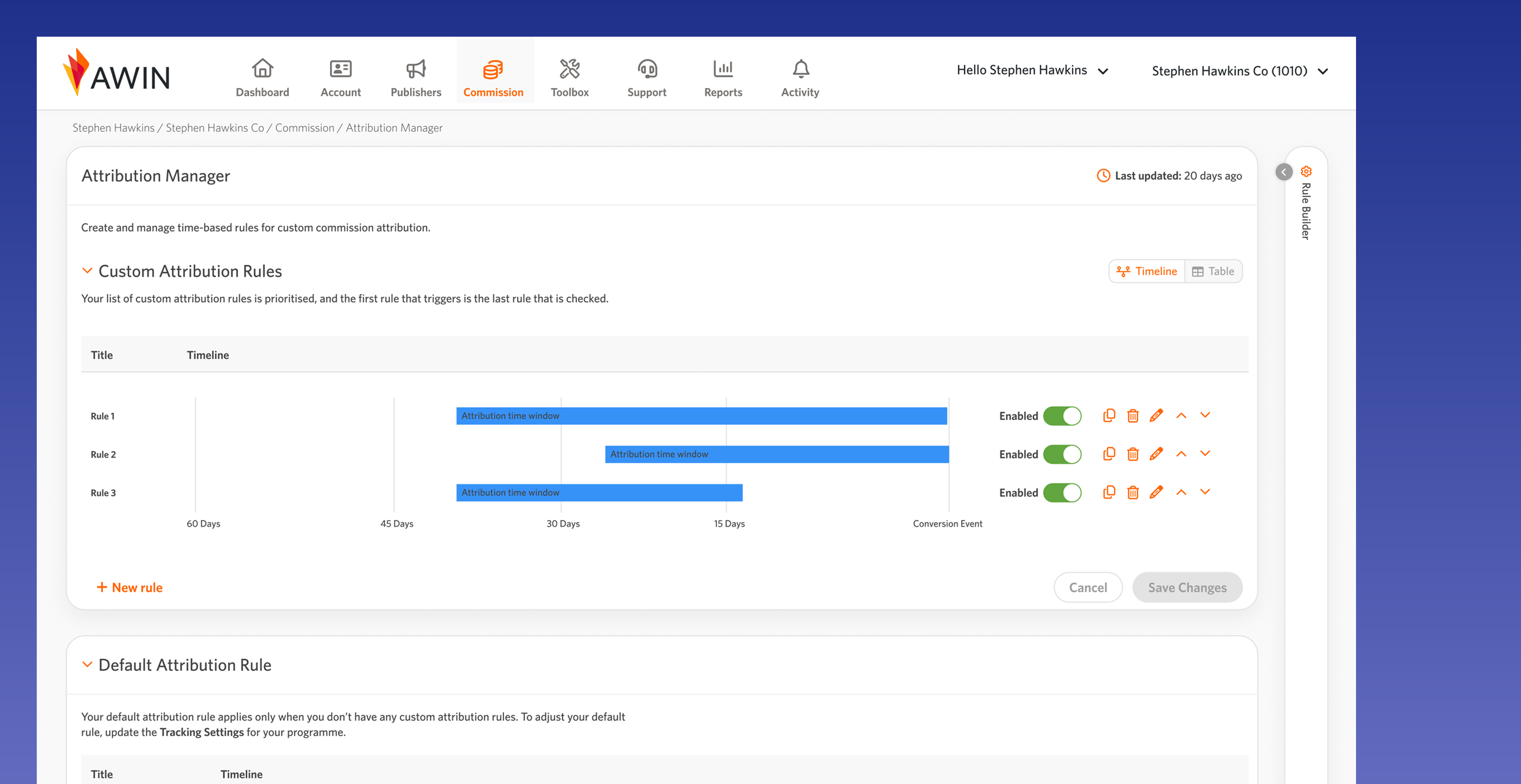
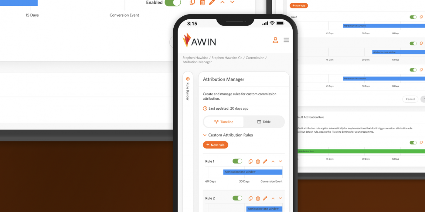
Welcome screen for the Attribution Manager
Existing Product & Problem
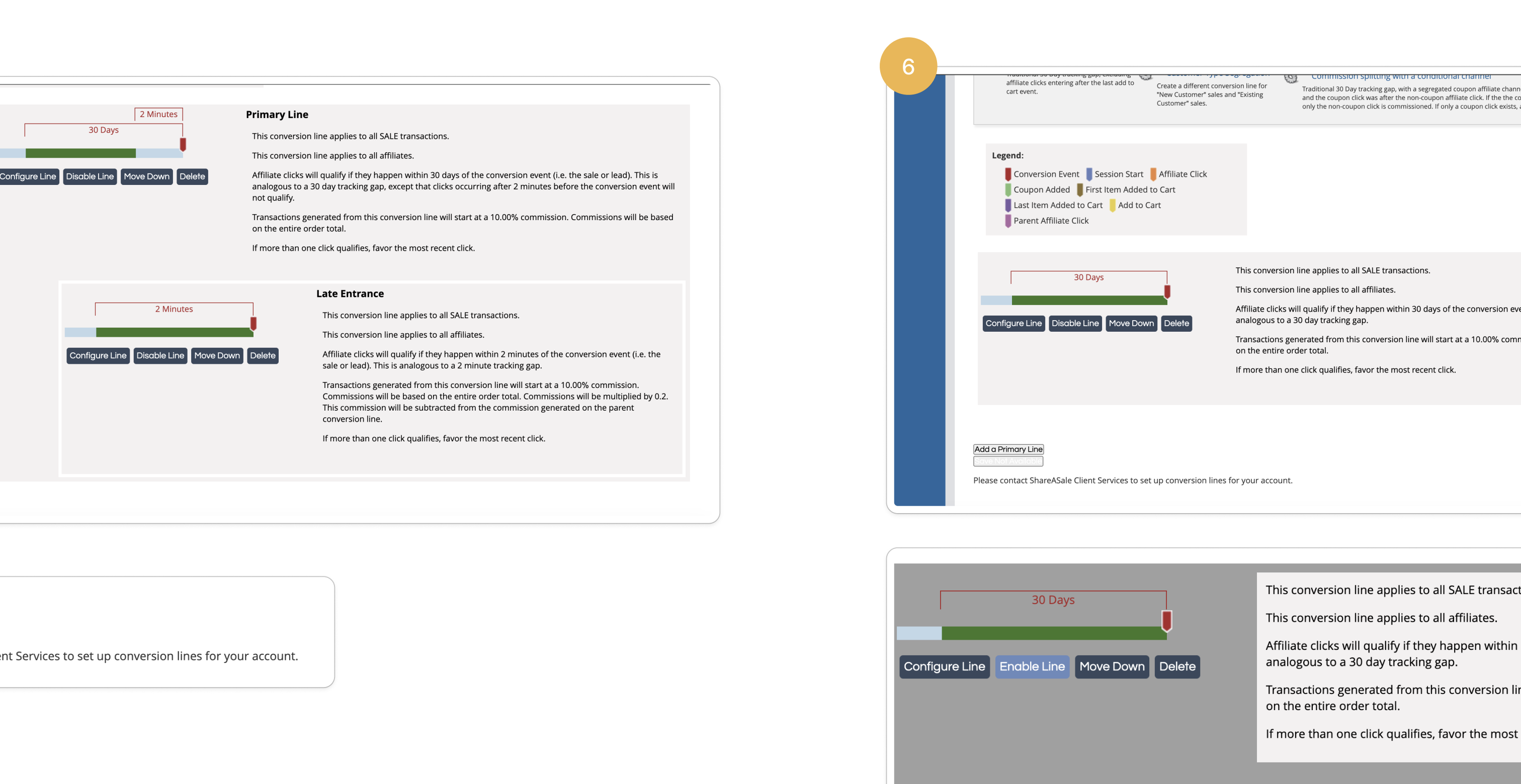
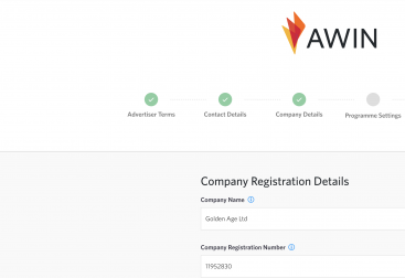
As advertisers migrated from our other platform, we had to ensure their existing attribution rules for commission payouts were retained. We also considered the UX for both new and existing customers when rolling out this feature.
Process
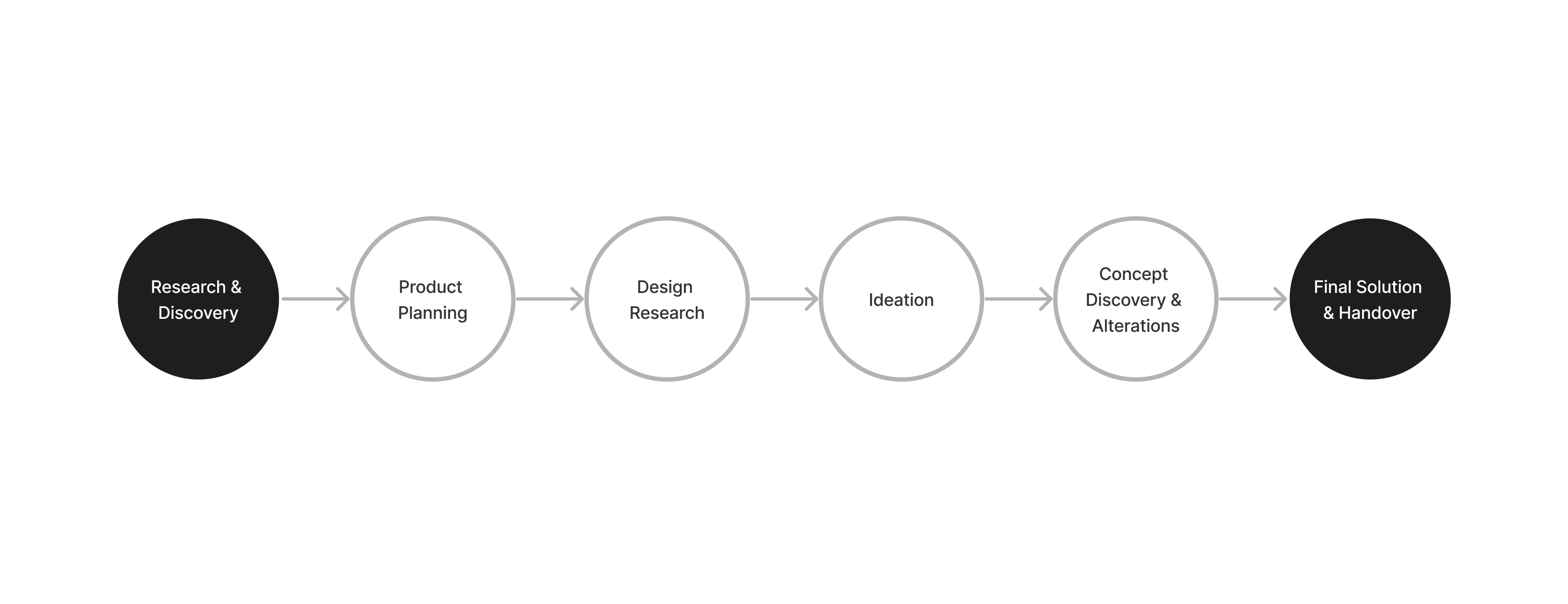
Research & Discovery
[videojs_video url=”https://www.gd86.co.uk/wp-content/uploads/2024/06/attribution_research.mov” autoplay=”true” controls=”true” loop=”true”]
To understand business and customer needs, we interviewed senior managers and account managers from our sister company, focusing on pain points and customer interactions. We discovered that few customers used the feature, requiring consultation with an account manager to get started.
I audited our current UI and explored common UX patterns for rule builders. Collaborating with the content designer, we refined wording and iconography and created user journeys to shape the feature flow.
Concerns
We had limited usability insights, so we relied on stakeholder interview data. With the feature being developed ahead of the 2025 migration, we made several assumptions. To simplify the complex feature, we used familiar UI elements and considered first-time user experience.
Ideation
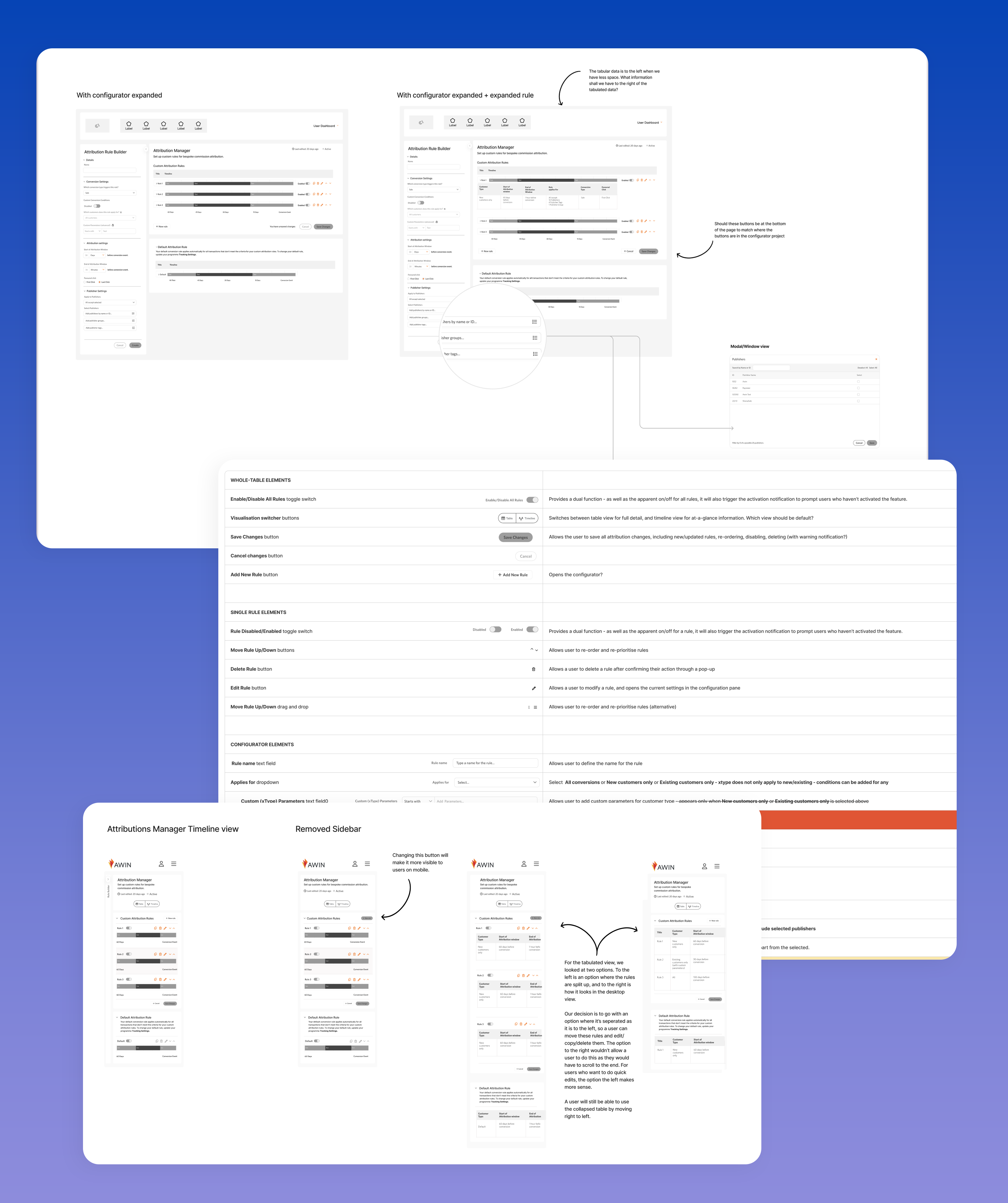
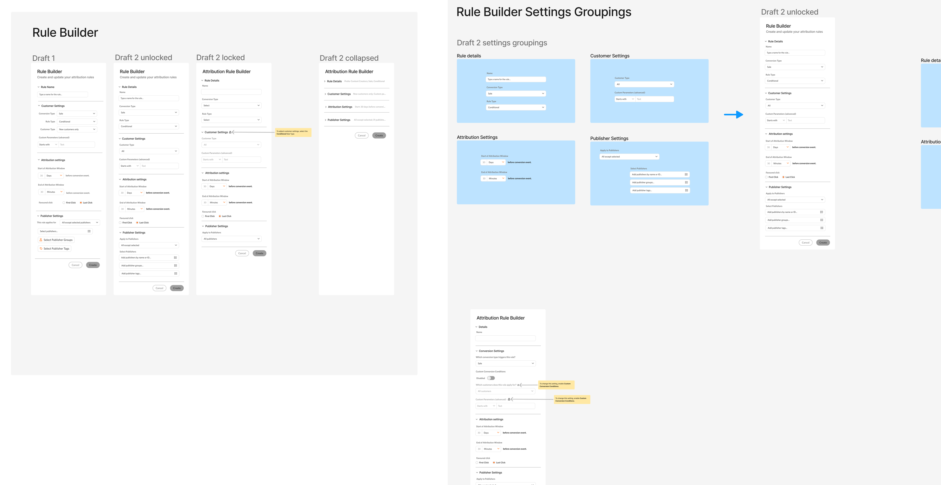
With the content designer, we initially sketched layout concepts for commission attribution views, progressing to low and mid-fidelity designs. We then reviewed each component and icon in detail with stakeholders to decide on the final design elements.
From our interviews, we learned that customers found setting up rules confusing due to unclear language. Collaborating with the content designer, we streamlined components and improved language to enhance user understanding while interacting with the rule builder.
Based on internal feedback about future changes to the main top-level navigation moving to the left, I researched how other rule builders integrated with left navigation. I wanted to ensure that the rules remained the main focus and that customers could easily view information across different screen sizes.
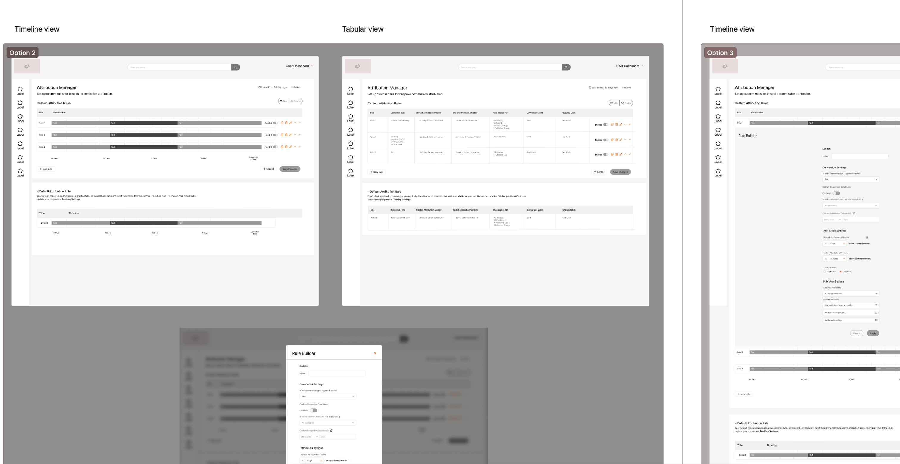
We experimented with different layouts for the rule builder, exploring options using an accordion-style UX and a toggle/switcher UX view to determine the most effective placement.
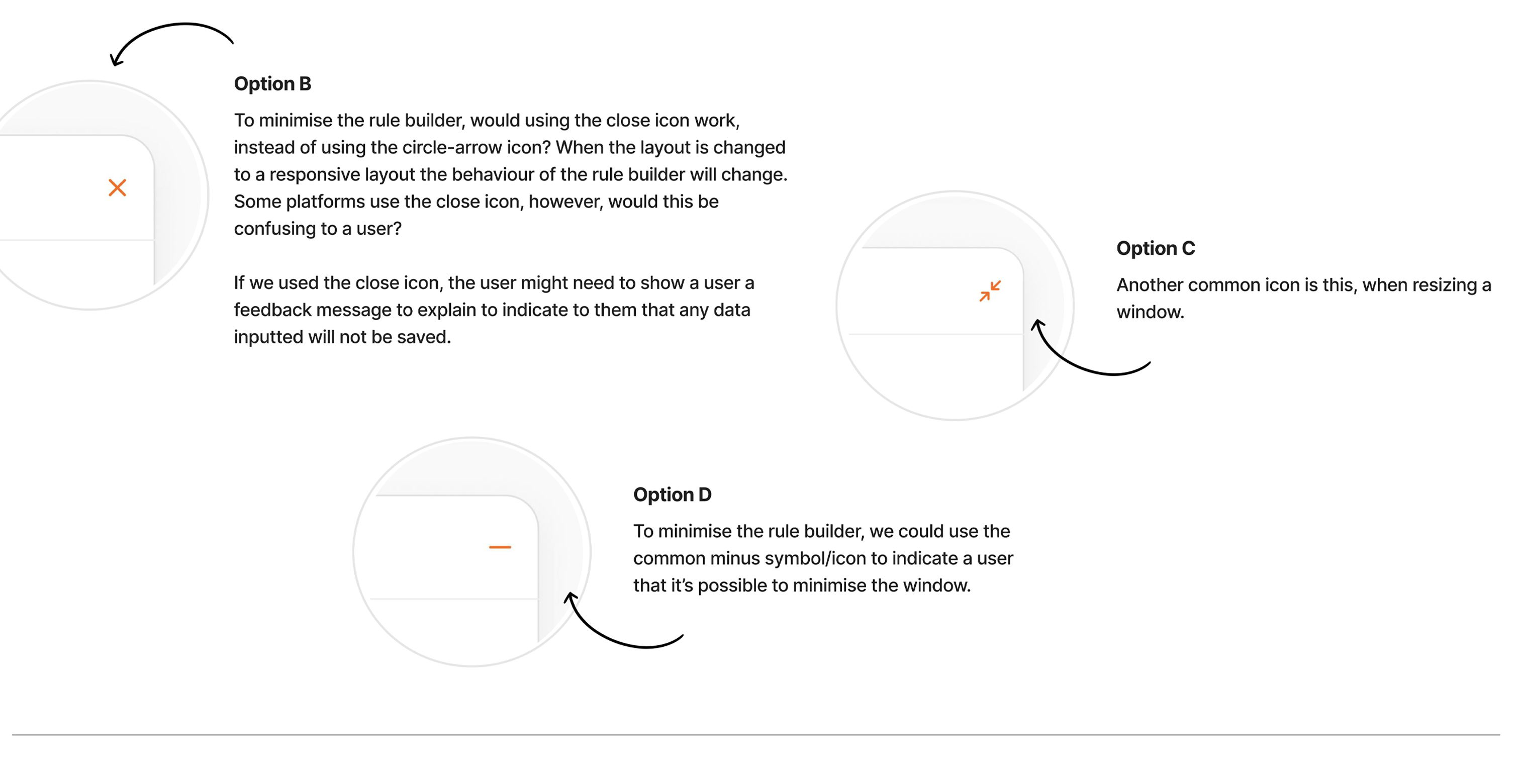
We reviewed wireframe ideas and component choices with stakeholders and our internal UX team, aiming to introduce new features while leveraging existing components from our design system.
Solution
[videojs_video url=”https://www.gd86.co.uk/wp-content/uploads/2024/06/attribution_solution.mov” autoplay=”true” controls=”true” loop=”true”]
We developed a product that provided a clear overview of essential features for customers, ensuring a smoother UX for migrated users.
We showcased various setups for the rule builder and interactions within the attribution manager. We also mapped out flows to address potential edge cases thoroughly.
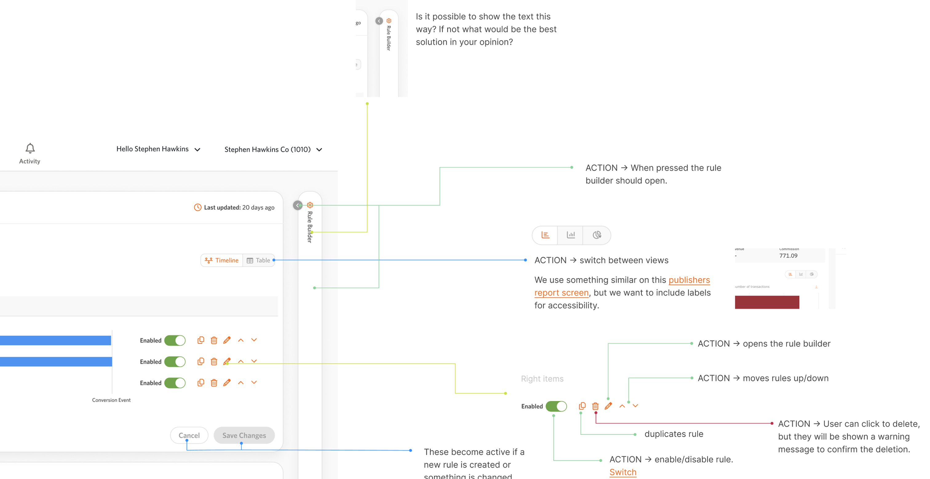
Collaborating closely with stakeholders and engineers, I documented use cases, features, and components for the attribution manager. This included detailing interactions and referencing our design system components, ensuring clarity for both stakeholders and developers during development.
Future Vision
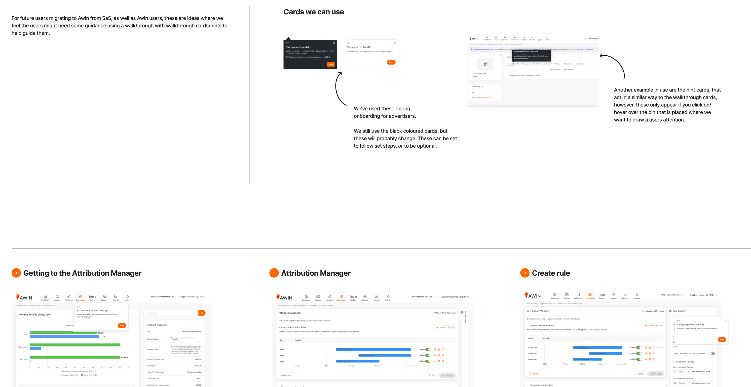
During discovery, we identified the business goal of ensuring a smooth migration for customers familiar with the Attribution Manager. The content designer and I also considered messages for first-time users. Stakeholders suggested using a wizard for onboarding, so we highlighted key areas where customers might need assistance.
Key Takeaways
We delivered a product with familiar UX for migrated customers, ensuring it’s easy to understand and use at a glance. Despite the initially undefined scope and a tight six-week timeline, we focused our efforts effectively.
Post-release, we plan to enhance value by conducting qualitative research to improve the end-to-end user experience. Although the project was brief, we maximized our time and resources.