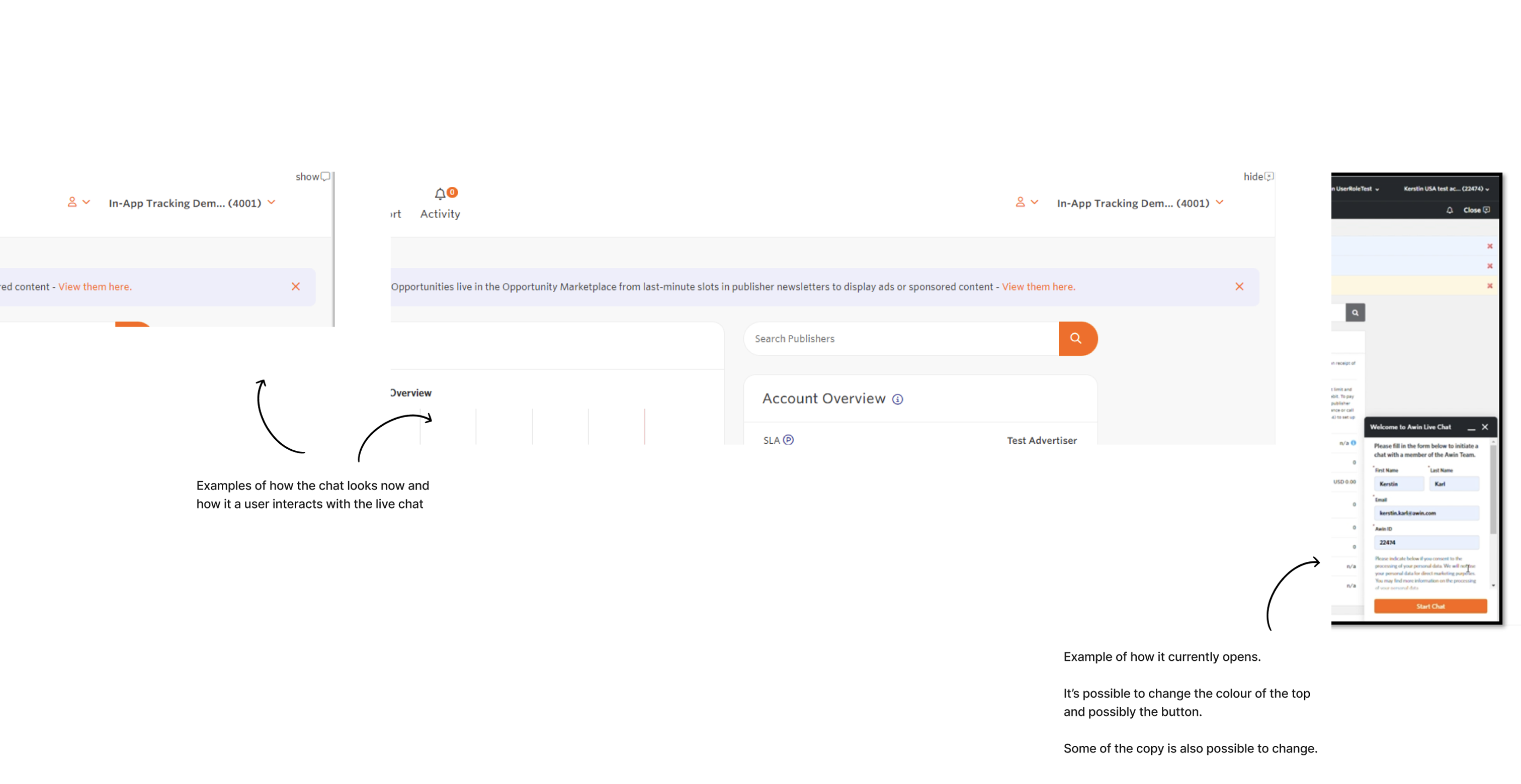
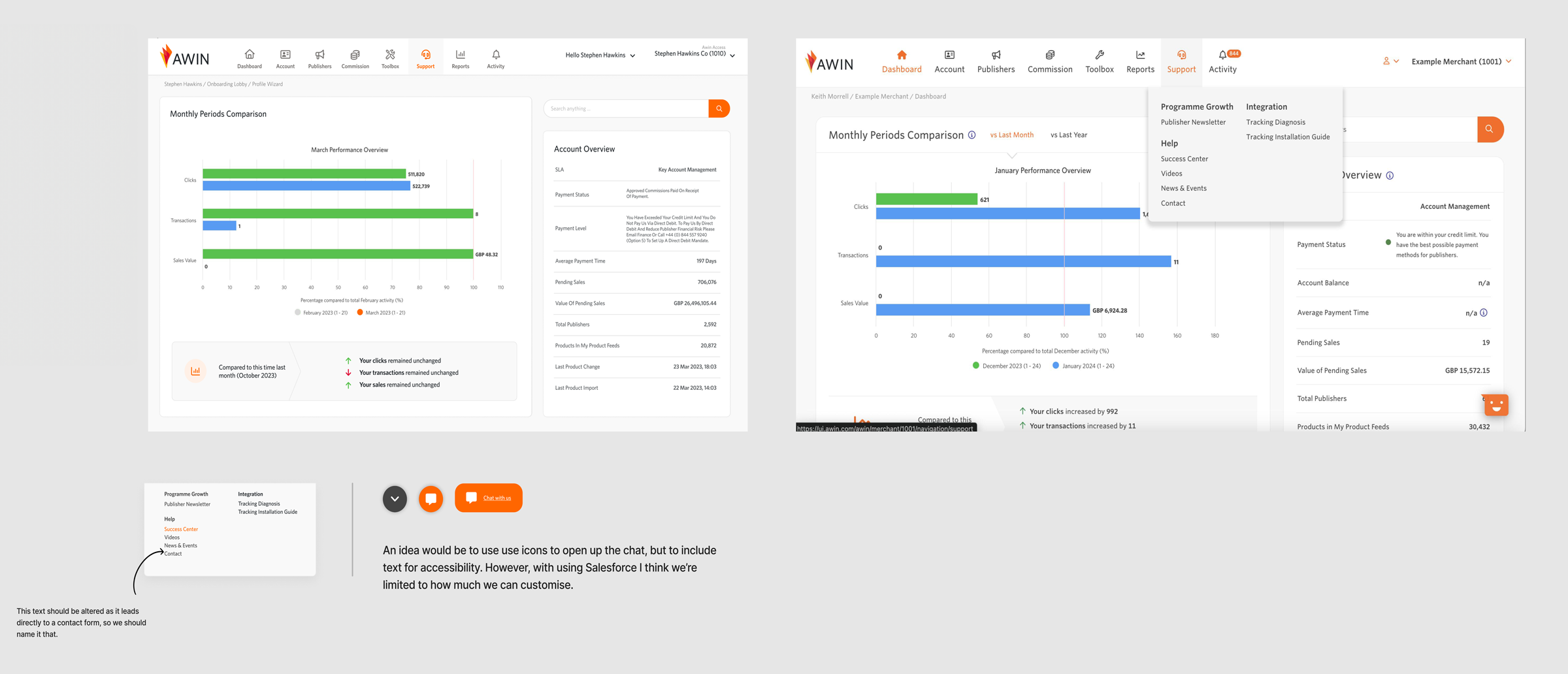
The live chat button in the UI had been hidden since the UI refresh and the US team wanted to bring this back.
- Scope: Research & Concept
- Role: Concept, Research & Visual Identity
- Tools: Figma & Figjam
- Collaborators: UX Writer & Product Owner
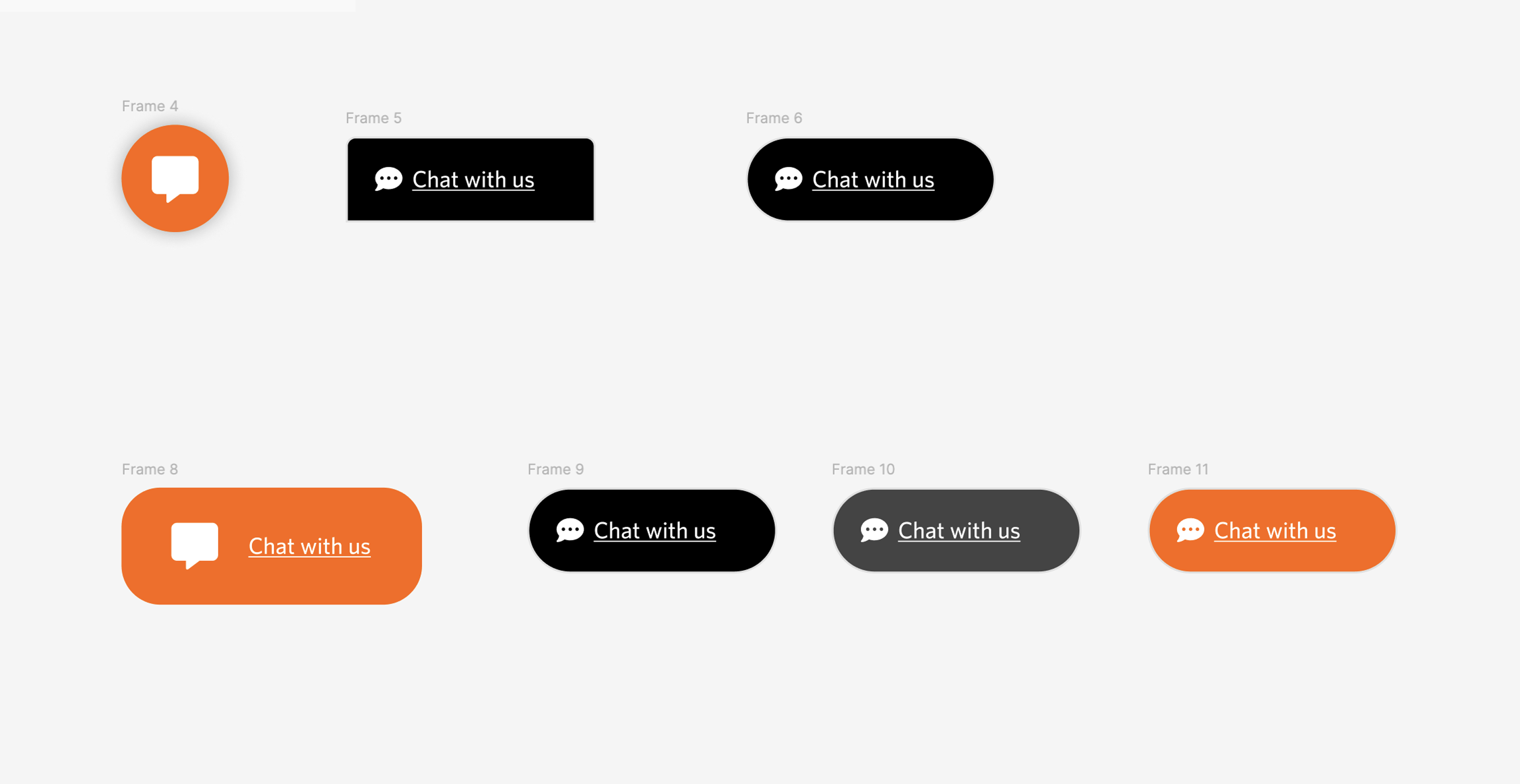
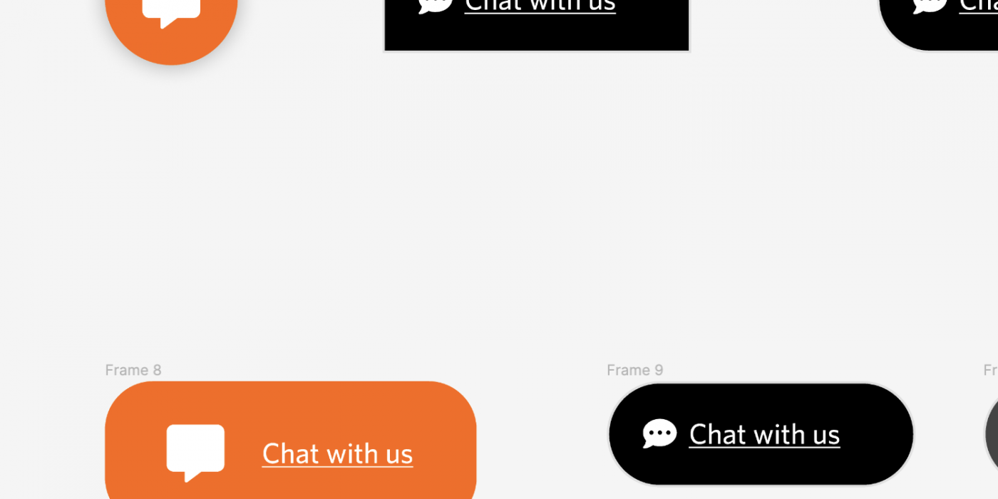
Live chat button examples
Existing Product & Problem
With the Martech launch, a new theme was introduced, and the Salesforce chatbot was removed, impacting customer support. The US team wanted the feature to be reintroduced, so we were asked to review the UX of the feature and provide recommendations for its future use.
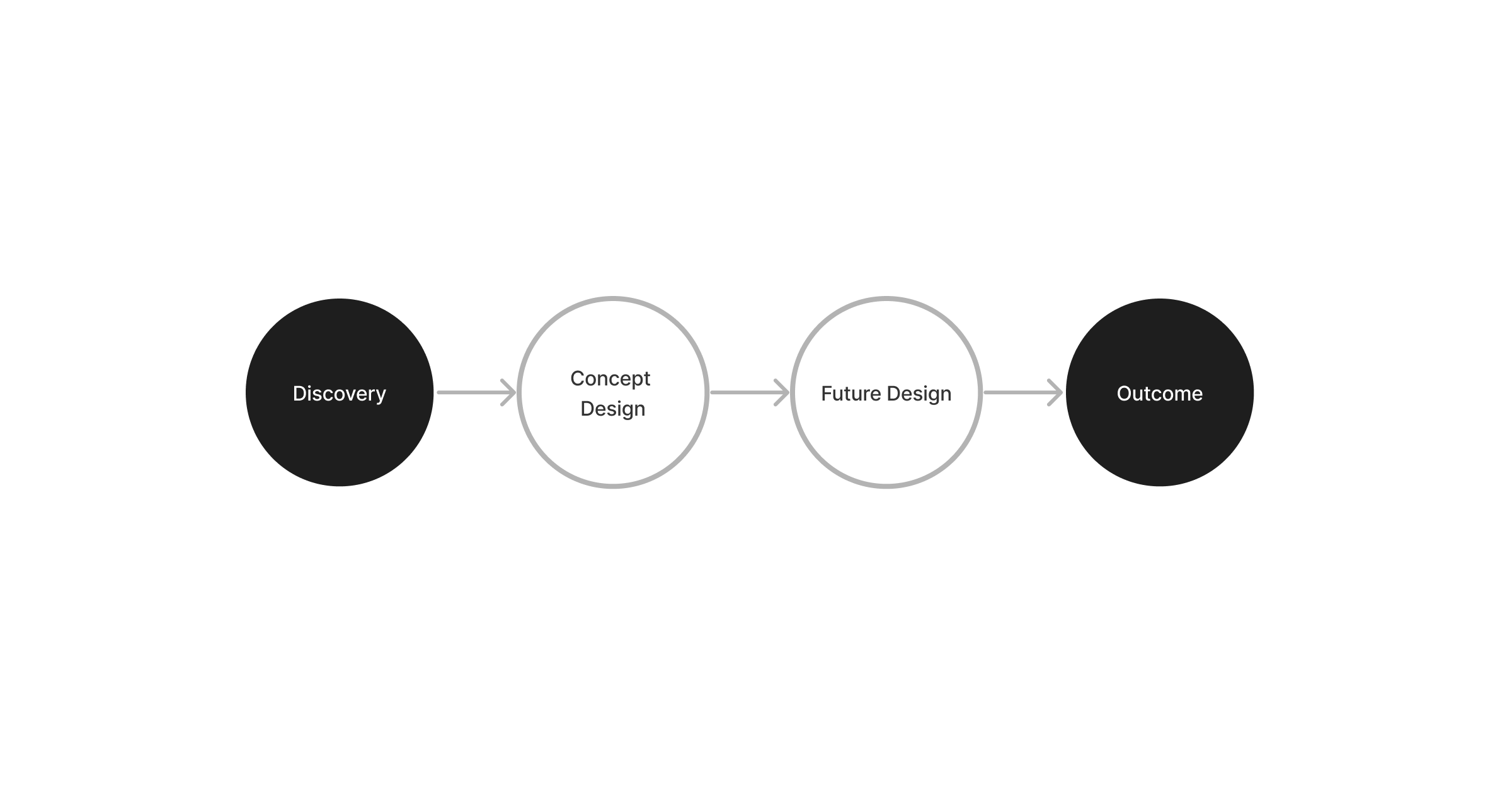
Process
Research
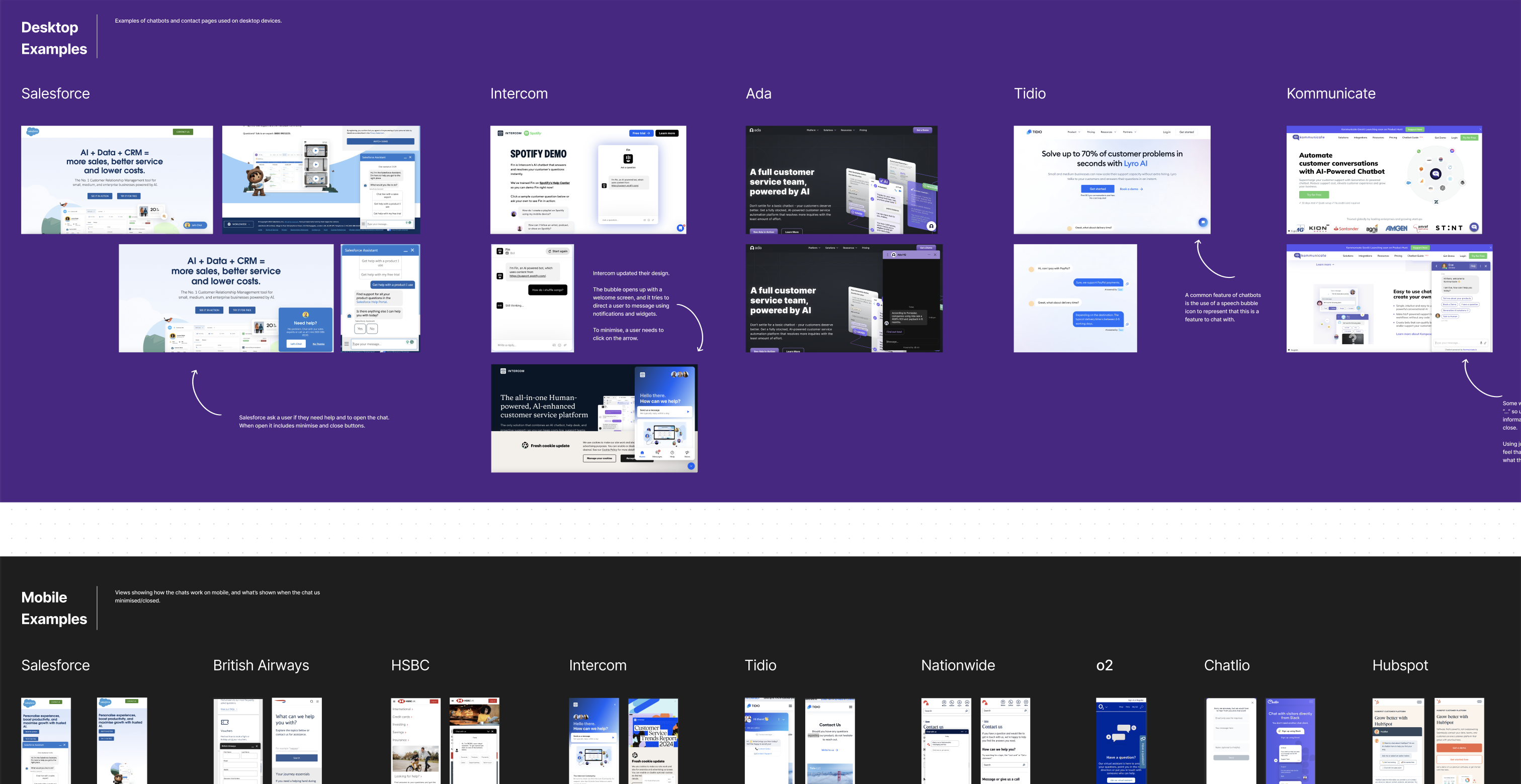
We researched live chat tools used by other companies, focusing on familiar UX features and common interactions for desktop and mobile. Our goal was to avoid annoying users by displaying the chat too soon and ensure it didn’t disrupt their journey by occupying too much screen space.

I looked into what iconography would be used for the icon to open the live chat, as so many different types of bubbles can be used, so I wanted to use what I chose as recognisable by all users as a chat feature.
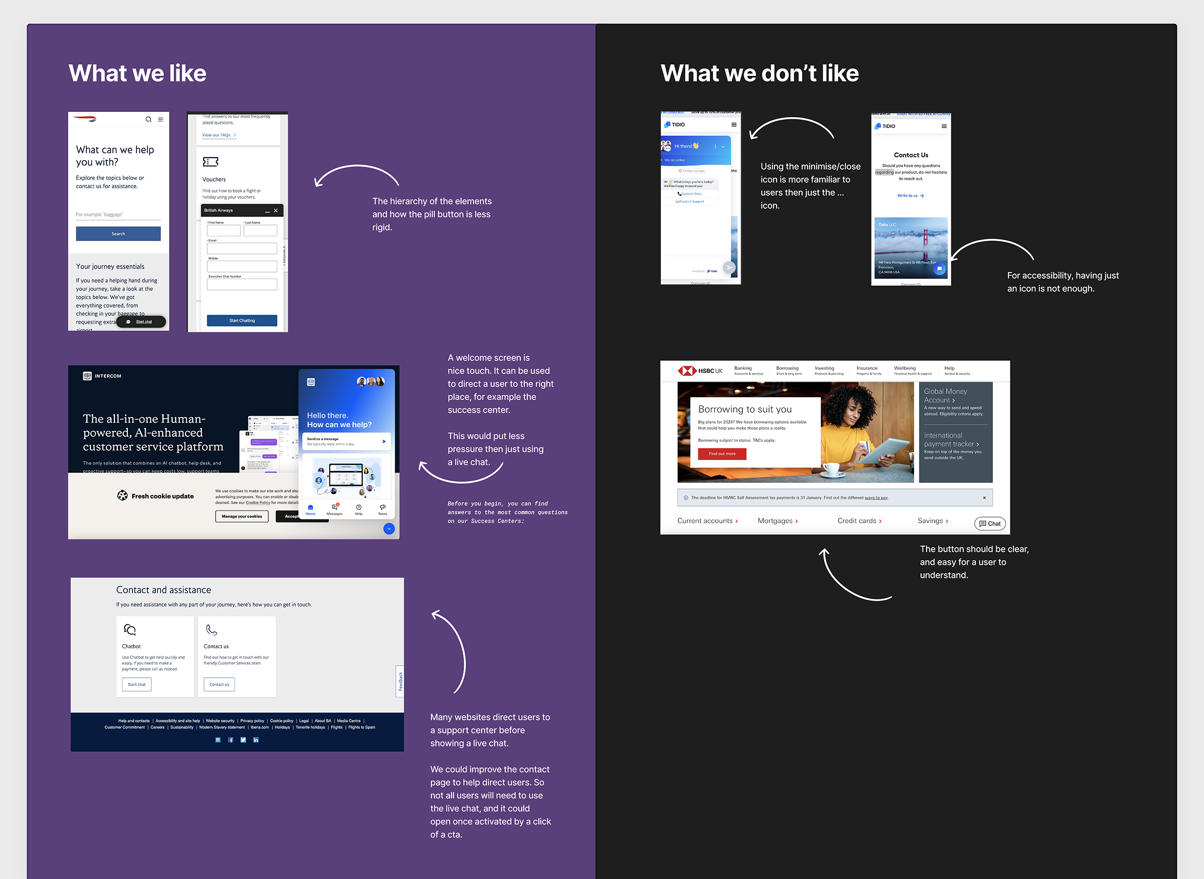
We found examples of Salesforce chat on mobile and desktop, which helped us understand their design and interactions. This comparison informed our discussions with stakeholders about which features to keep or omit.
Ideation
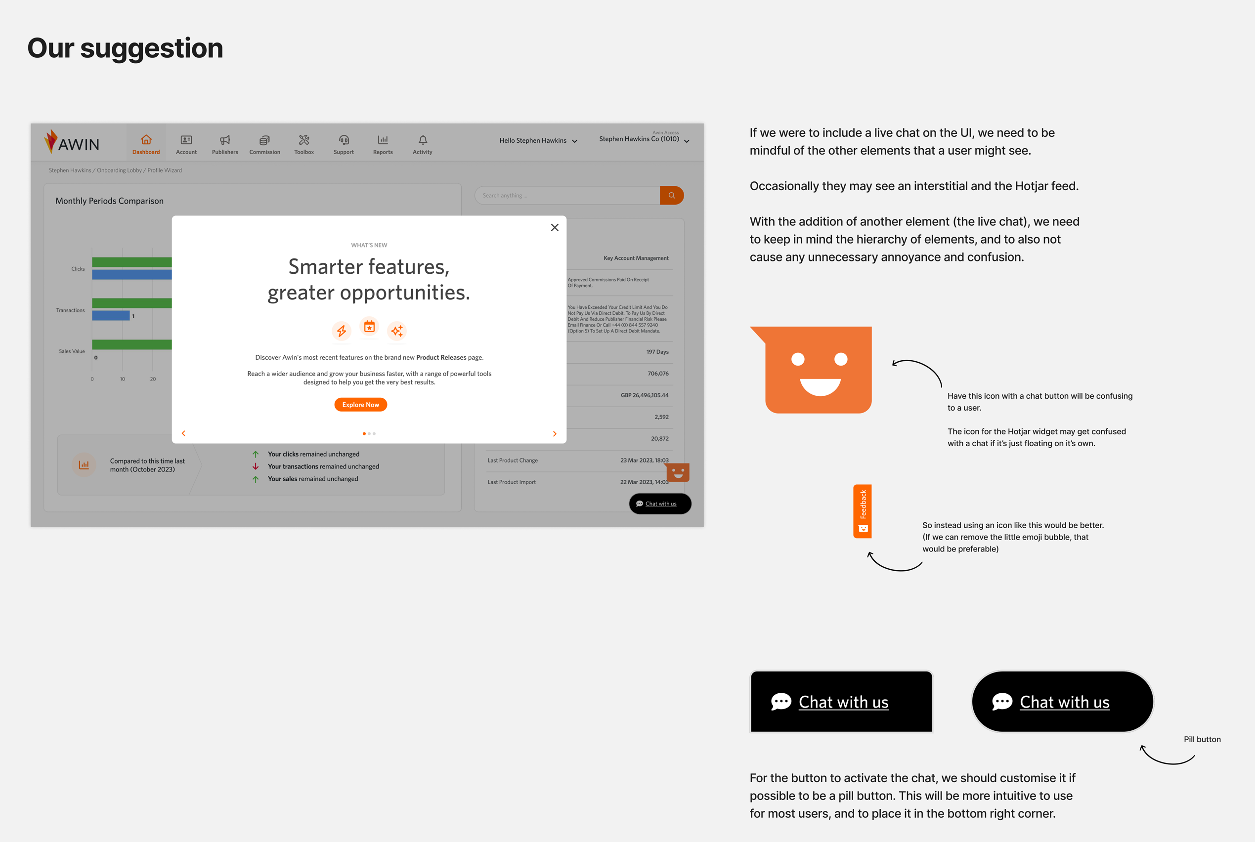
The UX writer and I discussed whether to hide the live chat in the navigation or place it on the page, as our new resource centre had been launched and the idea was to push more traffic to it.
We aimed to avoid overwhelming customers with too many popovers and feedback widgets.
We also considered the design and interaction of the live chat icon for accessibility.
Outcome
We reviewed user recordings to understand issues with the previous live chat feature, which we presented to stakeholders.
We proposed placing the live chat on the page, suggesting its hierarchy among other popovers. Our accessibility research recommended including text with the icon, avoiding colour conflicts with other components, and using a friendly pill button design.
However, late user insights revealed by the stakeholder, informed us about the low usage and high maintenance costs of the live chat, leading us to decide against reintroducing the live chat.
Future Vision
[videojs_video url=”https://www.gd86.co.uk/wp-content/uploads/2024/04/future_vision_livechat.mov” autoplay=”true” controls=”true” preload=”metadata” loop=”true”]
Our research revealed that customers struggle to get help within the app. While we decided against reintroducing live chat, we proposed improving the UX by creating a support page.
Currently, customers navigate via drop-down navigation links, or they see a sitemap-like page when clicking on the top-level navigation. We suggested simplifying navigation and settings and making it easier to access help through a support page with a contact form or a future embedded live chat.