UI Improvements for the web app.
- Role: Concepts & Visual Design
- Tools: Illustrator & Photoshop
- Collaborators: Project Manager & Engineers

Concept idea for the app viewed on mobile.
Overview
When I joined Lisuto, they had some UI elements in place and needed my assistance to update the design and enhance consistency. Collaborating with the Project Manager and Engineers, I developed new UI components and standardized layouts. These improvements streamlined the development process for new features across the app.
Internal UI For Processes
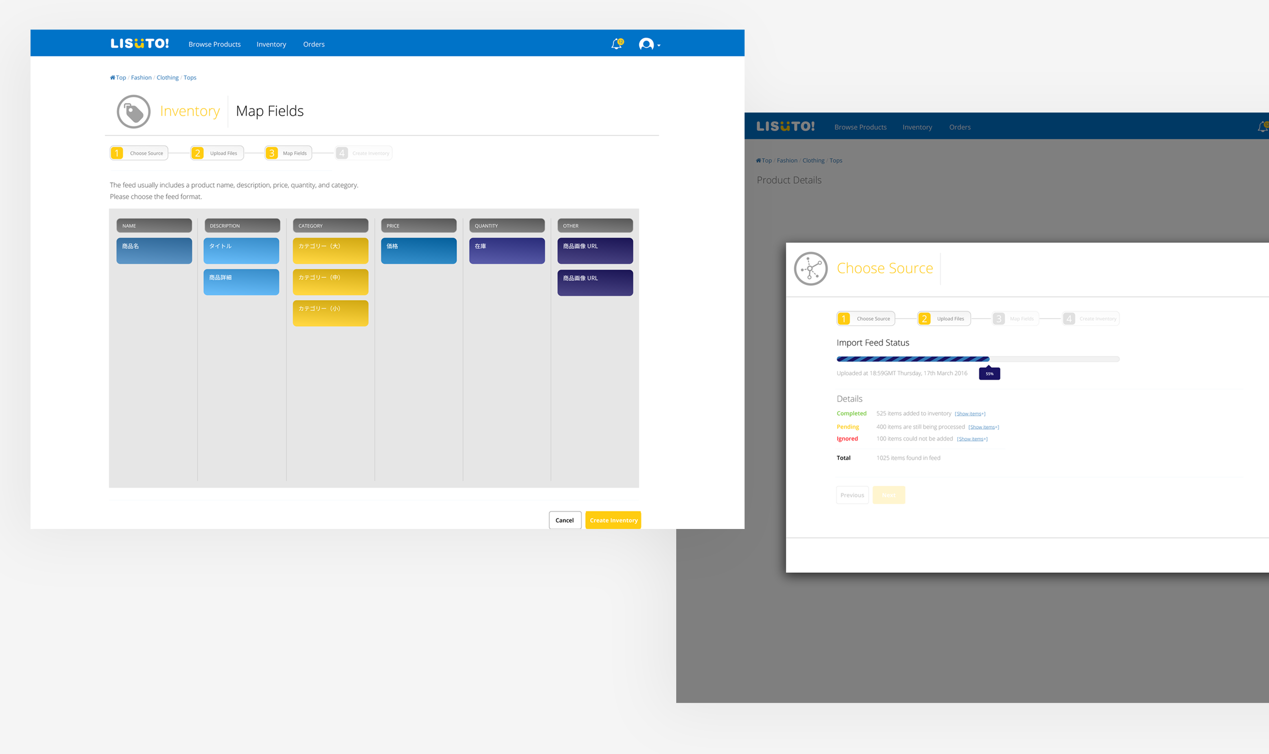
The product’s main service was to import, manage, and categorize product inventory feeds, syncing them with e-commerce marketplaces in multiple languages to enable global sales.
I created prototypes such as the examples above. The prototype shows the user flow for importing product feeds, featuring a linear progress bar for tracking large uploads. Users could interact by dragging and dropping cells to map content to provided labels.
For new features, I designed components and collaborated closely with engineers to ensure feasibility and meet requirements. This was standard practice. For updates to existing features, I audited pages and components with the Project Manager and Engineers to align on necessary changes and clarify delivery requirements.
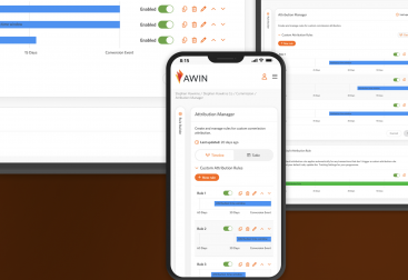
Mobile App Concept & Ideation
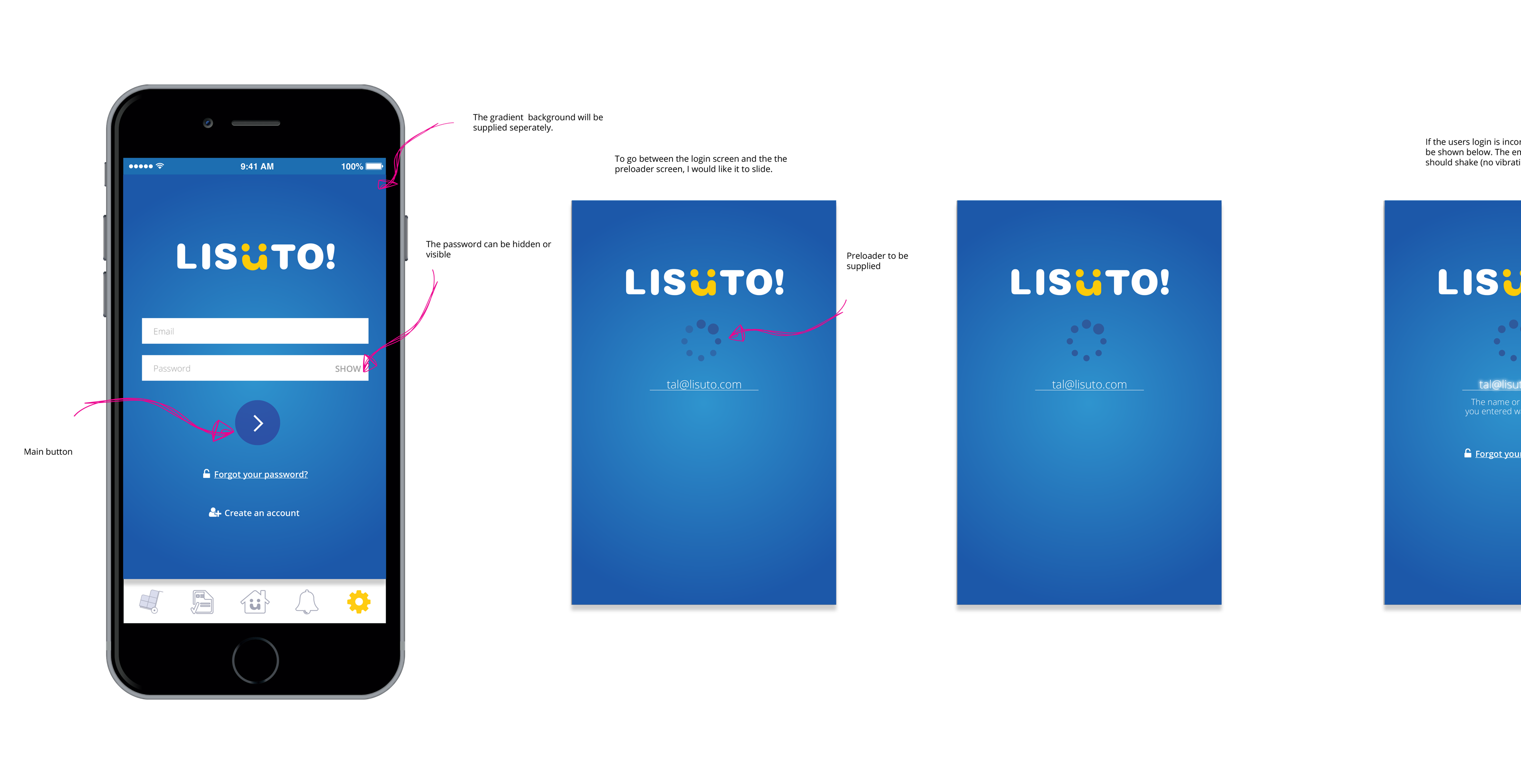
Our user base predominantly used desktop screens, backed by quantitative data. To broaden our audience, the company aimed to launch an iOS app. I collaborated closely with an external agency to design iOS screens and prototypes, focusing on navigation, interactions, and animations to enhance user engagement.
The prototypes included designs for the login/logout process, navigation flow, and feed display. Despite promising progress, the project was discontinued due to financial constraints.
I believed this initiative could have attracted more users, but the decision to discontinue was beyond my control.
Support Page
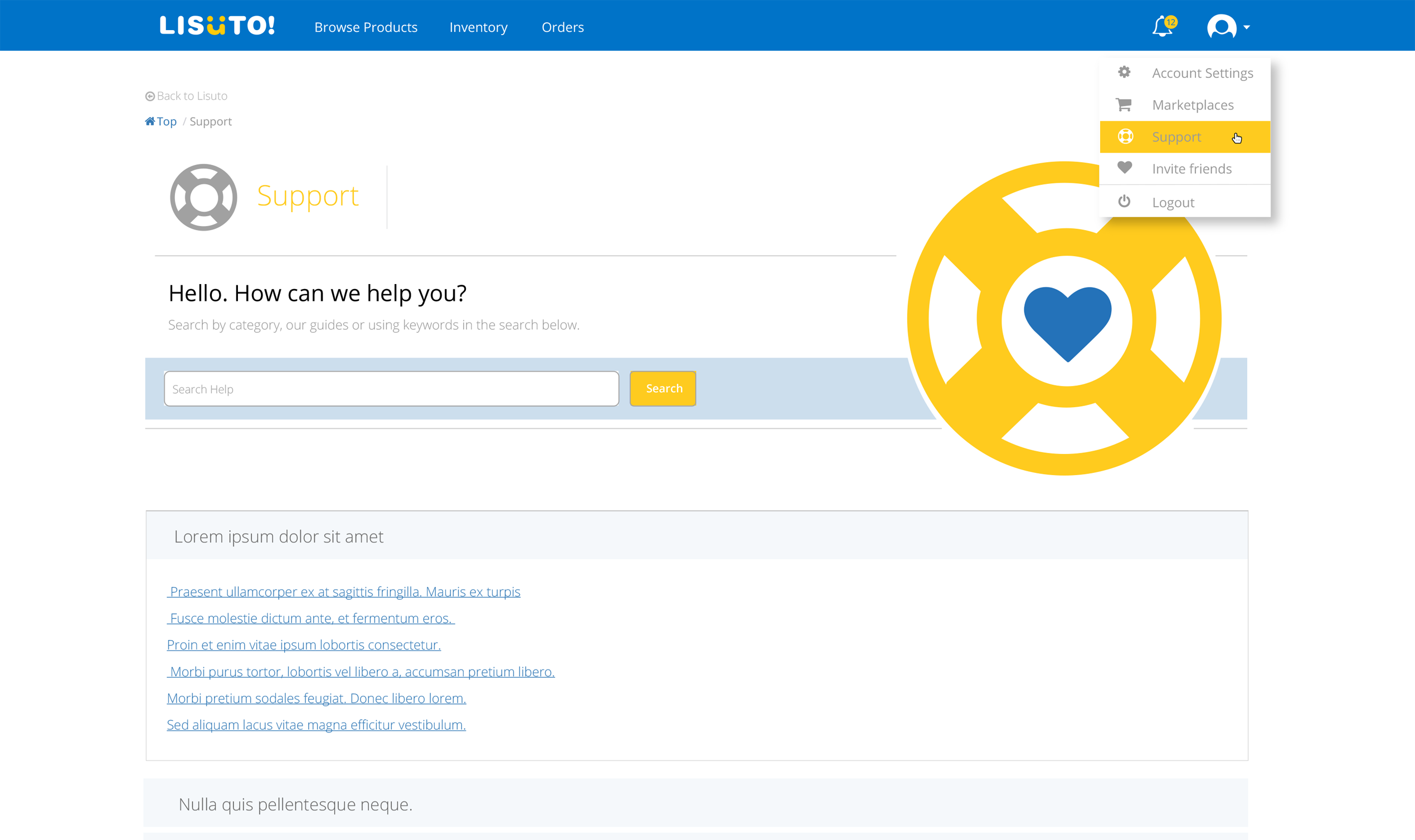
We enhanced the UI and UX of our support pages by improving accessibility with labelled icons in the navigation and moving it under the account section instead of the footer.
I used icons—a lifebuoy for support and a heart for customer care—to create an appealing design. A search feature at the top would allow users to find FAQs quickly.
FAQs were organised below using an accordion interaction for easier navigation of the questions.
Due to limited resources and time, I created the prototype in HTML and CSS to help the engineers integrate the prototype into the app.
Other UI Updates
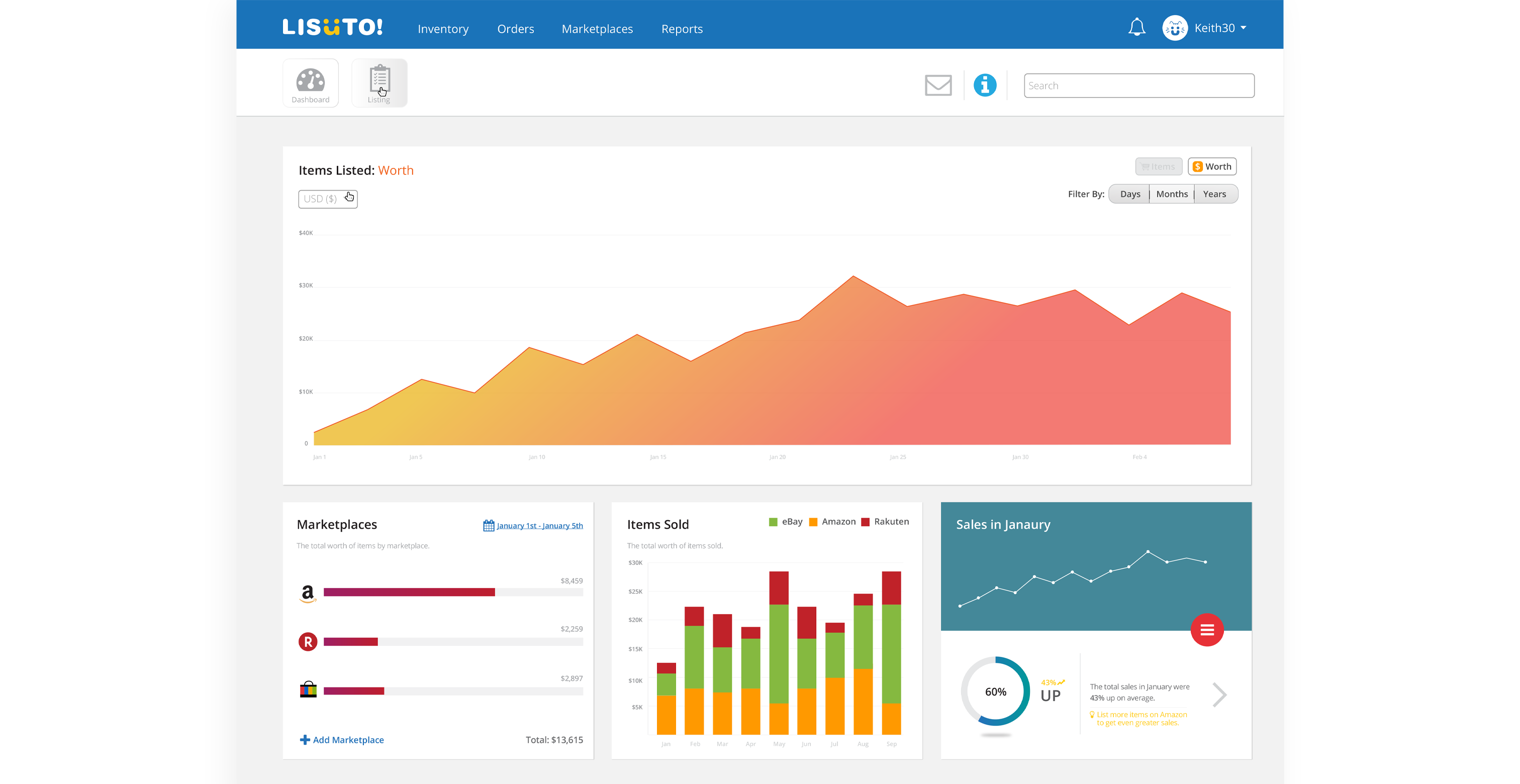
To improve UX for viewing sales, inventory stats, and listing items, we wanted to create a customisable dashboard with moveable widgets.
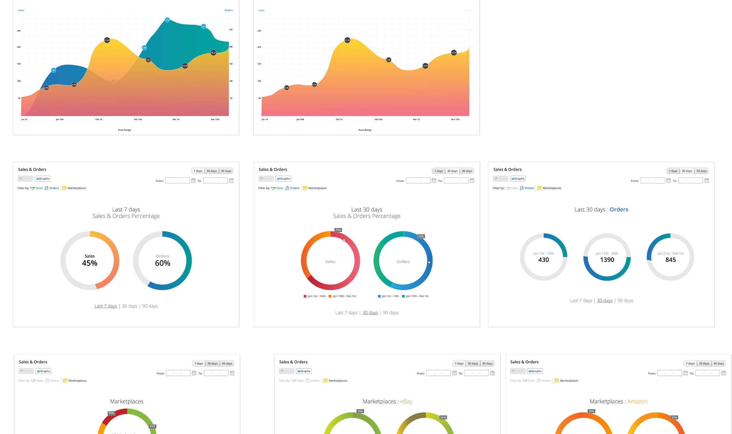
Examples of widgets include various graphs like area charts and donut charts.
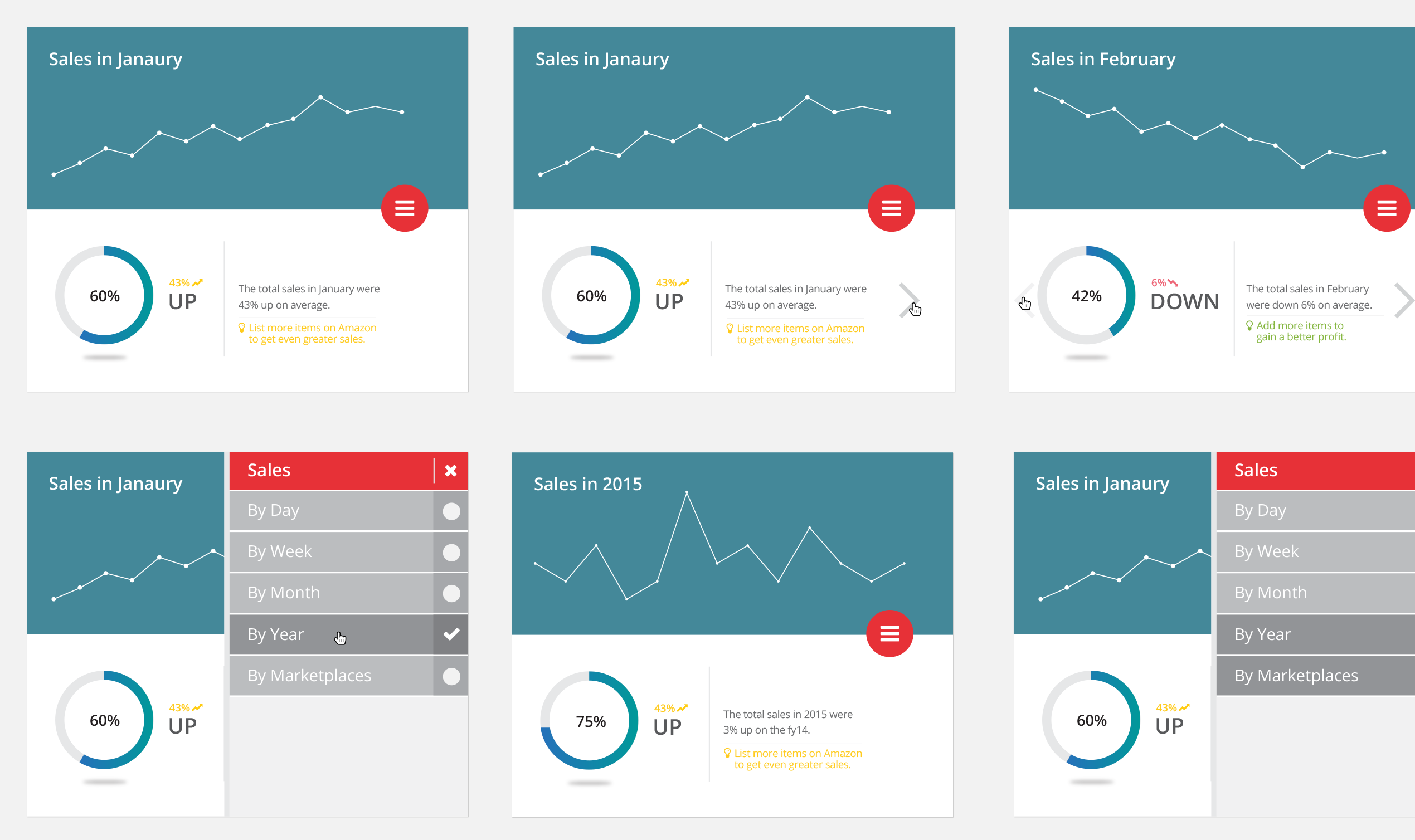
To implement more advanced statistics, I demonstrated examples of information display and filter usage, drawing inspiration from UI designs seen on other websites. Subsequently, I collaborated with engineers and stakeholders to refine these designs for the feature.
Widgets played a significant role in enhancing the personalized UX of the dashboard.
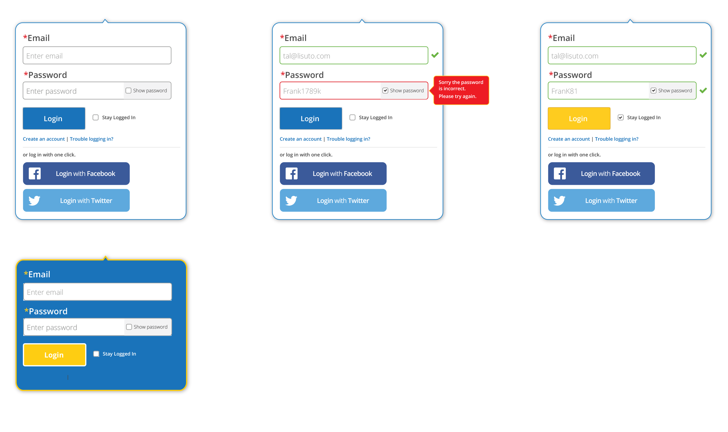
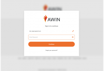
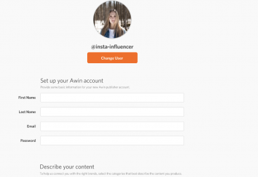
I explored login options to optimize the landing page for marketing our products and services. This included considering various use cases for the login box, such as error handling and confirmation messages. I discussed the technical feasibility and defined our scope with the Project Manager for enhancing the login experience.
Design Guides
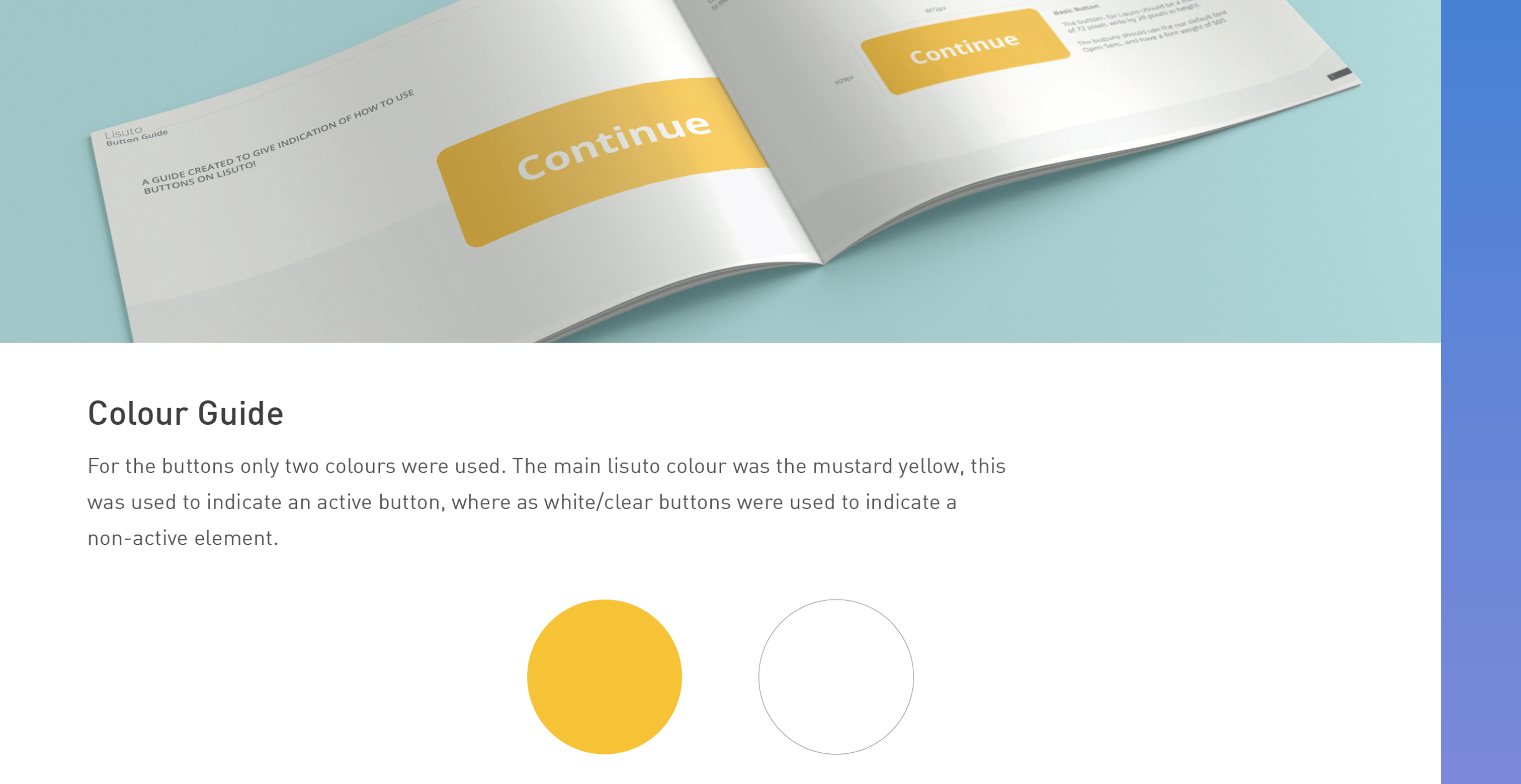
I created style guides for common components and features used in the app to ensure engineers understood these elements and maintained consistent interactions in the UI for a cohesive user experience (UX). These guides were valuable references for engineers in my absence, along with other documentation.
The Future
With the constantly evolving UI design, our focus was on improving components and establishing a design guide/system to speed up updates, whether for prototyping or aiding developers in implementation.
These efforts over time modernised the UI and enhanced the user experience of the web app.