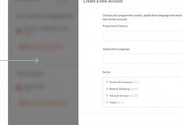
Users need a way of updating their payment details on the platform.
- Scope: Concept Design
- Role: Research & Visual Identity
- Tools: Figma & HTML
- Collaborators: Development Team & UX Writer
Updating Payment Method Flow.
Existing Product & Problem
When users sign up to the platform they have to enter their details to pay the monthly fee, as well as any fees they might have to pay publishers. We had no way for them to update their details, without the user having to reach out to a member of accounts to change the details.
Process
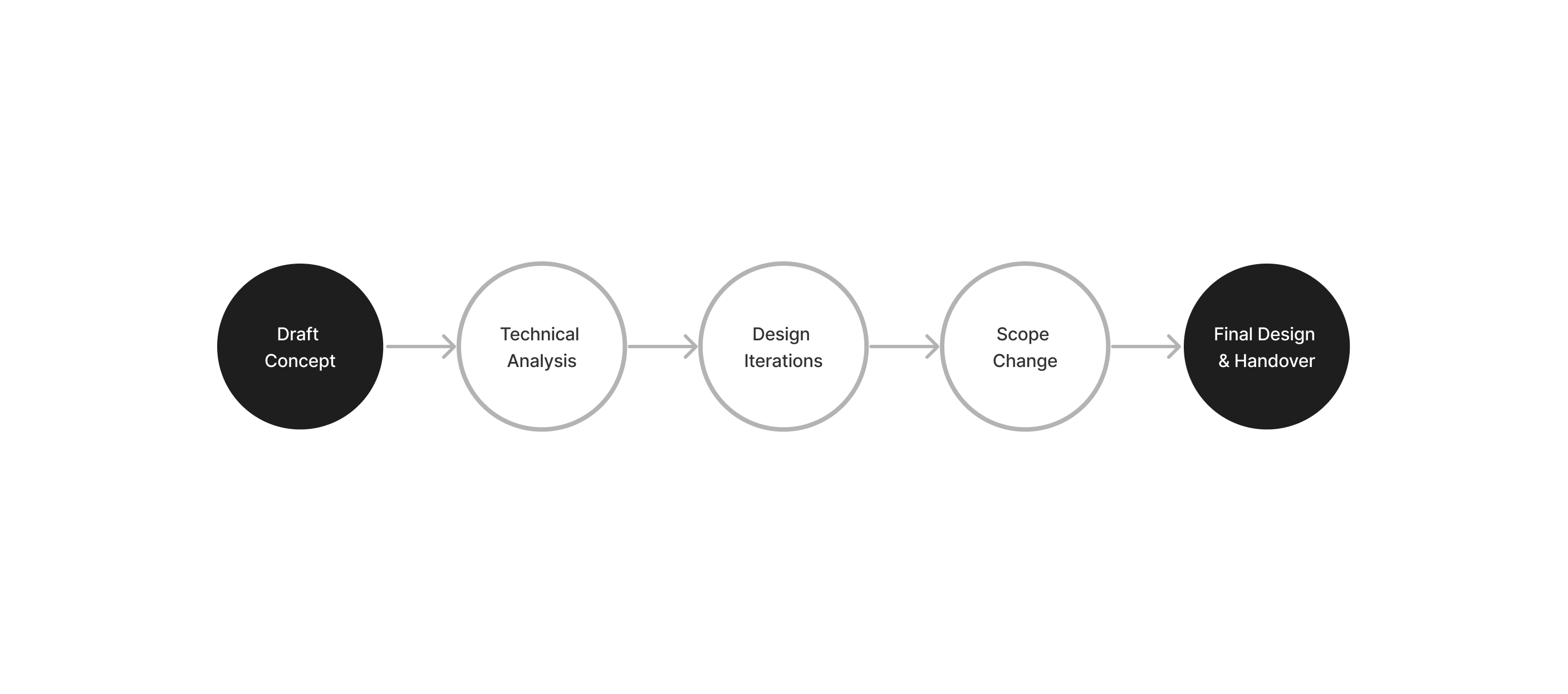
Design Research
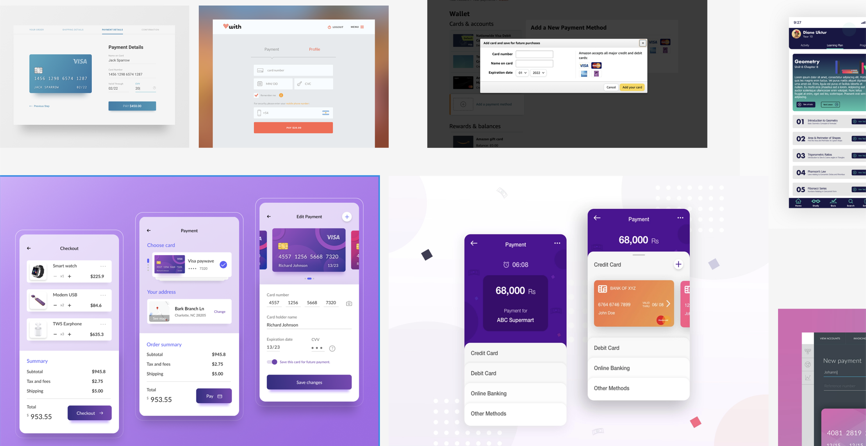
Despite short time frames for design and research due to the project scope, I explored examples to guide my idea creation, focusing on common patterns users encounter when updating payment methods in desktop and mobile apps.
Ideation
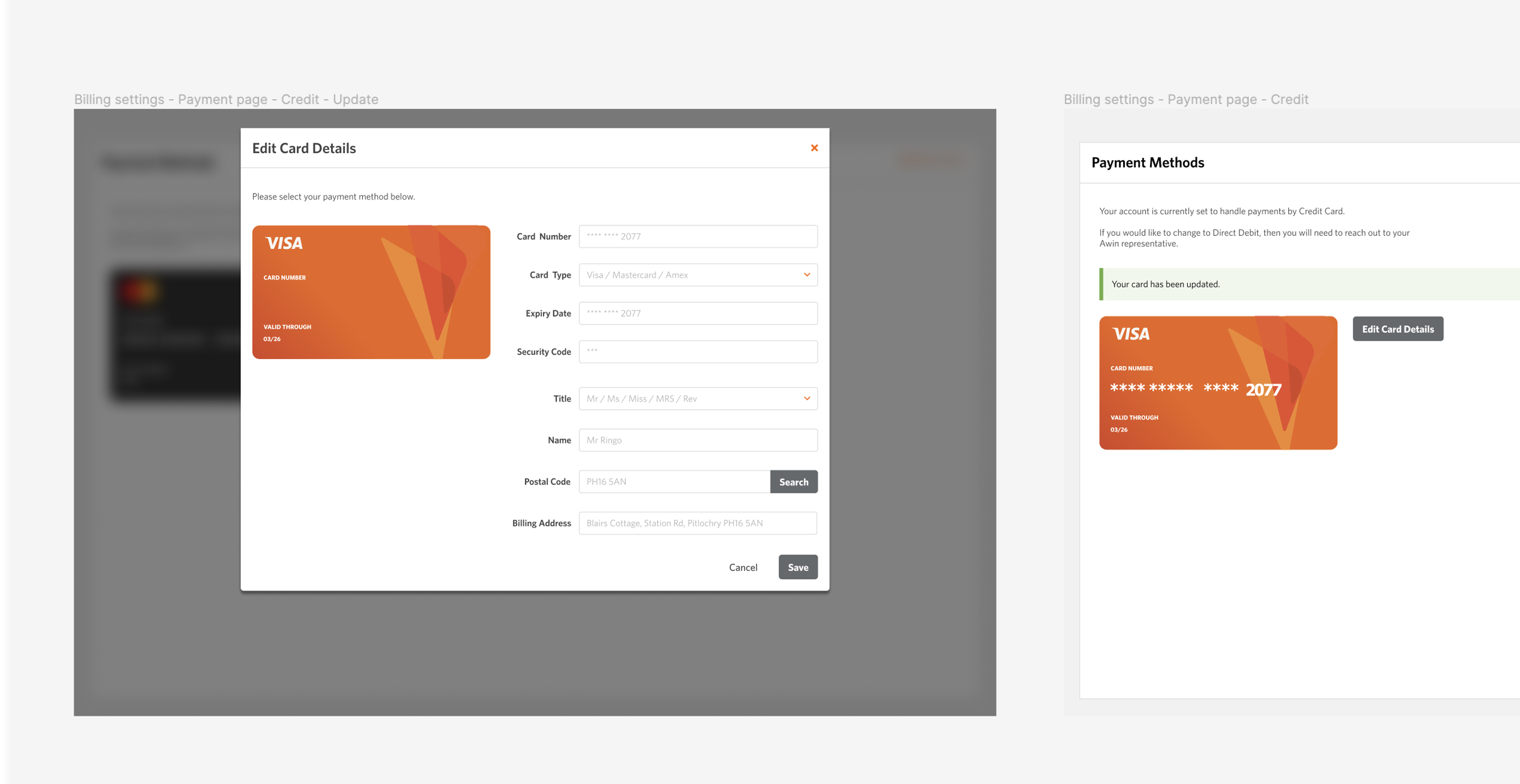
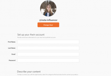
I designed a concept displaying the user’s existing card details retrieved from an API. Clicking on a call-to-action would open a window for updating or adding new card details. After completion, the card would be displayed with our branding.
Visual changes differentiated card types, aiding users in recognising changes. After updating or saving details, users received feedback messages. I collaborated with a UX writer to ensure users received relevant feedback during their experience.
Limitations
During technical discussions with engineers, I learned we would be using Worldpay. However, uncertainties surrounded the best approach and potential limitations. We learned when using Worldpay, users would either be redirected to a form or a new window, followed by redirection to a success/error page after form completion.
With Worldpay, design options were limited, especially regarding button styles and embedding. I created concepts for each option and collaborated with the Product Owner and engineers to come up with the best approach.
Solution
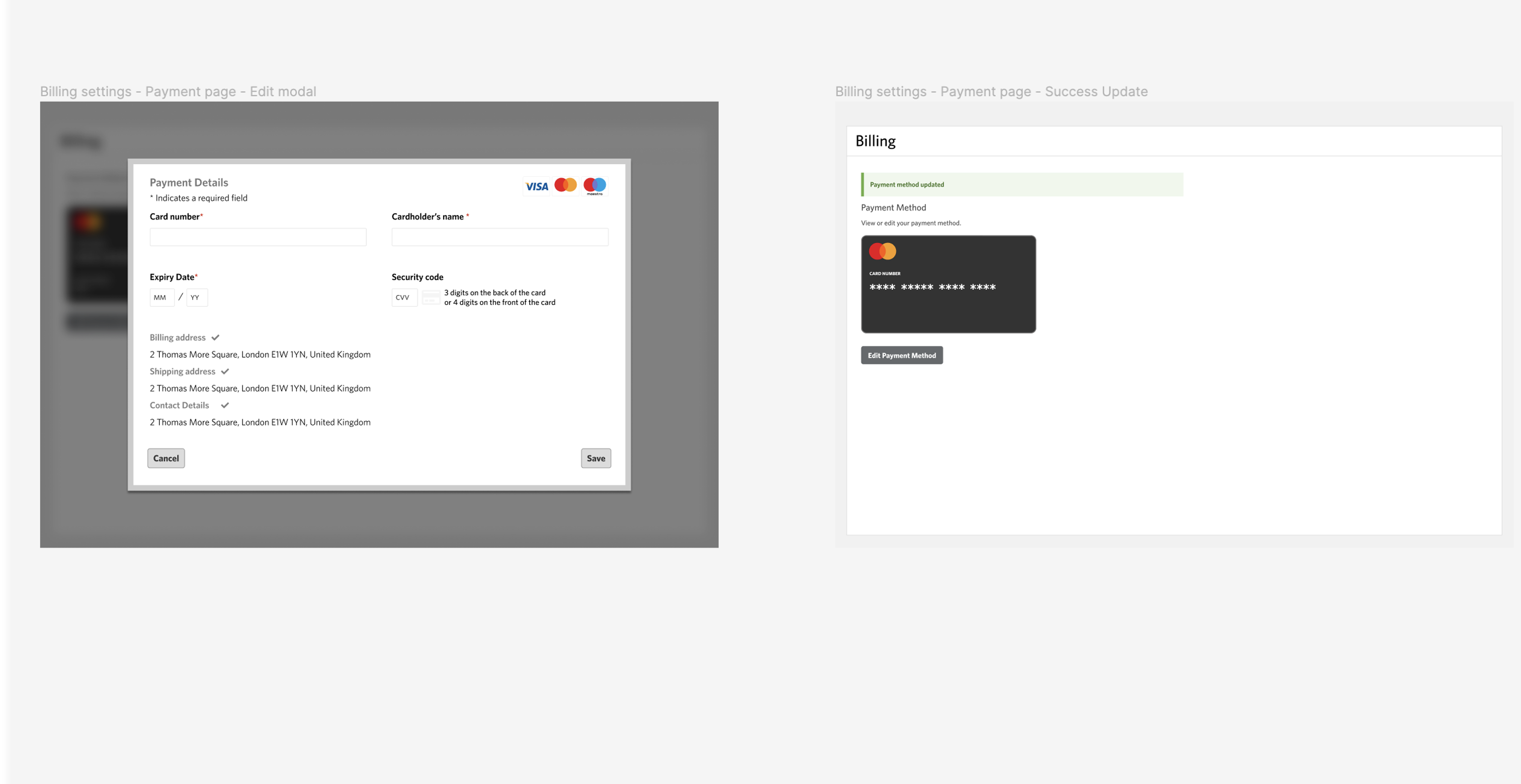
The chosen solution was to open a modal window linked to Worldpay, allowing users to edit and save their new card details. Users could also cancel the process by closing the window or clicking the cancel button.
For the initial release, due to API limitations and security concerns, we restricted the information shown on the card. Future releases will offer more customisation.
Key Takeaways
With this being a new feature we had to create something that worked with a payment provider that has limited functionality. With a limited time to do any research/design, I came up with a design that showed the information we wanted the user to see, and that was easy for them to use.