Revamping an Sewing company’s e-commerce website to enhance usability and give it a modern look and feel.
- Scope: Website Revamp
- Role: Concept, Research & Visual Identity
- Tools: Figma & Photoshop
- Collaborator: Developer
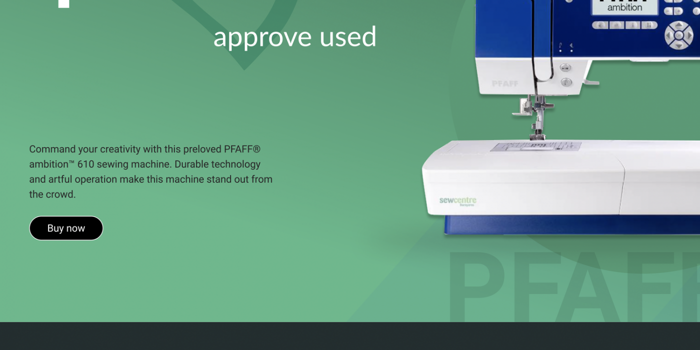
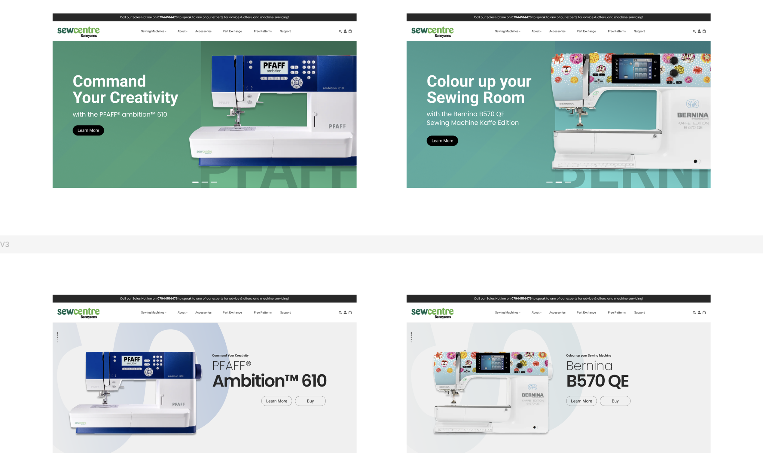
Concept idea for a hero screen.
Existing Product & Problem
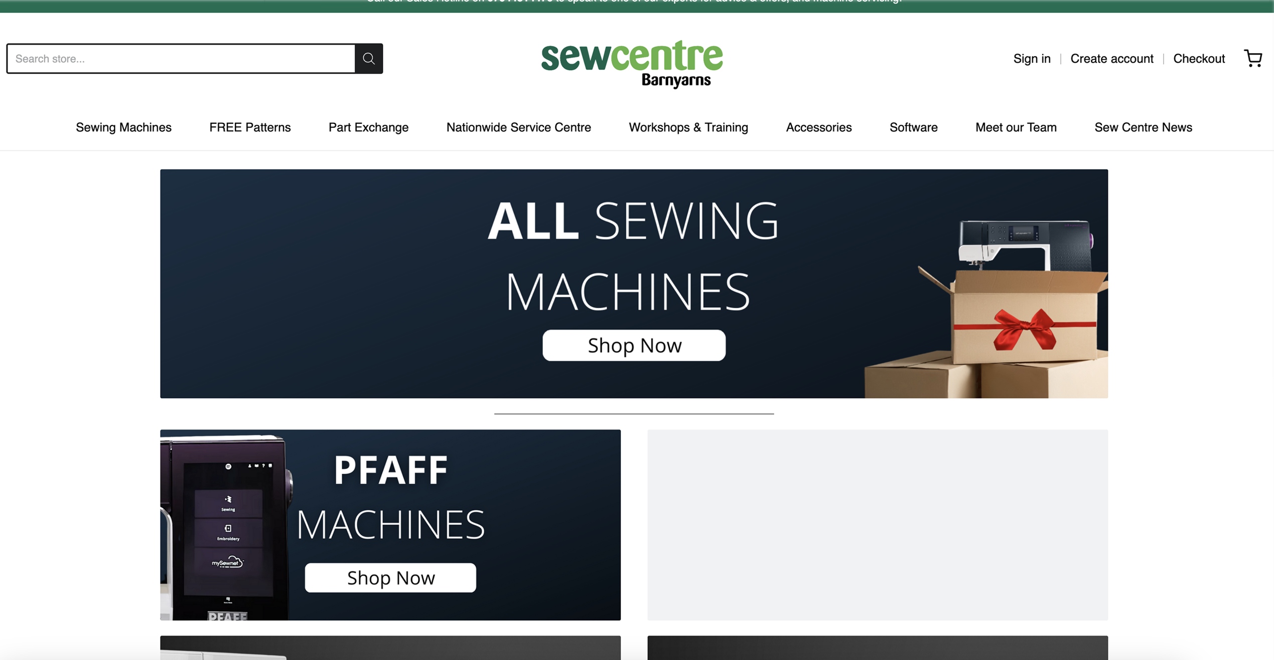
The existing website had an outdated appearance with overwhelming navigation, making product browsing challenging for users. The client wanted a refresh while retaining some historical pages, emphasising key features, and improving overall awareness.
Research

I researched competitors mentioned by the client with the developer, focusing on key features, design styles, page templates, and desktop/mobile navigation.
In discussions with the developer, we identified features we liked and disliked from the competitor analysis.
We audited the current website to determine which features to retain and improve. We then discussed our findings from the audit and competitor analysis with the client. This helped us develop a plan that aligned with the client’s vision and user feedback so that we could improve both the look and experience of the new website.
Ideation
[videojs_video url=”https://www.gd86.co.uk/wp-content/uploads/2024/04/wireframes.mov” autoplay=”true” controls=”true” loop=”true”]
I created three concept ideas inspired by websites I liked, focusing on the homepage, product overview page, and product details page.
Each concept used features from the current website and competitors. I discussed them with the developer to learn about any technical limitations before presenting them to the client for feedback.
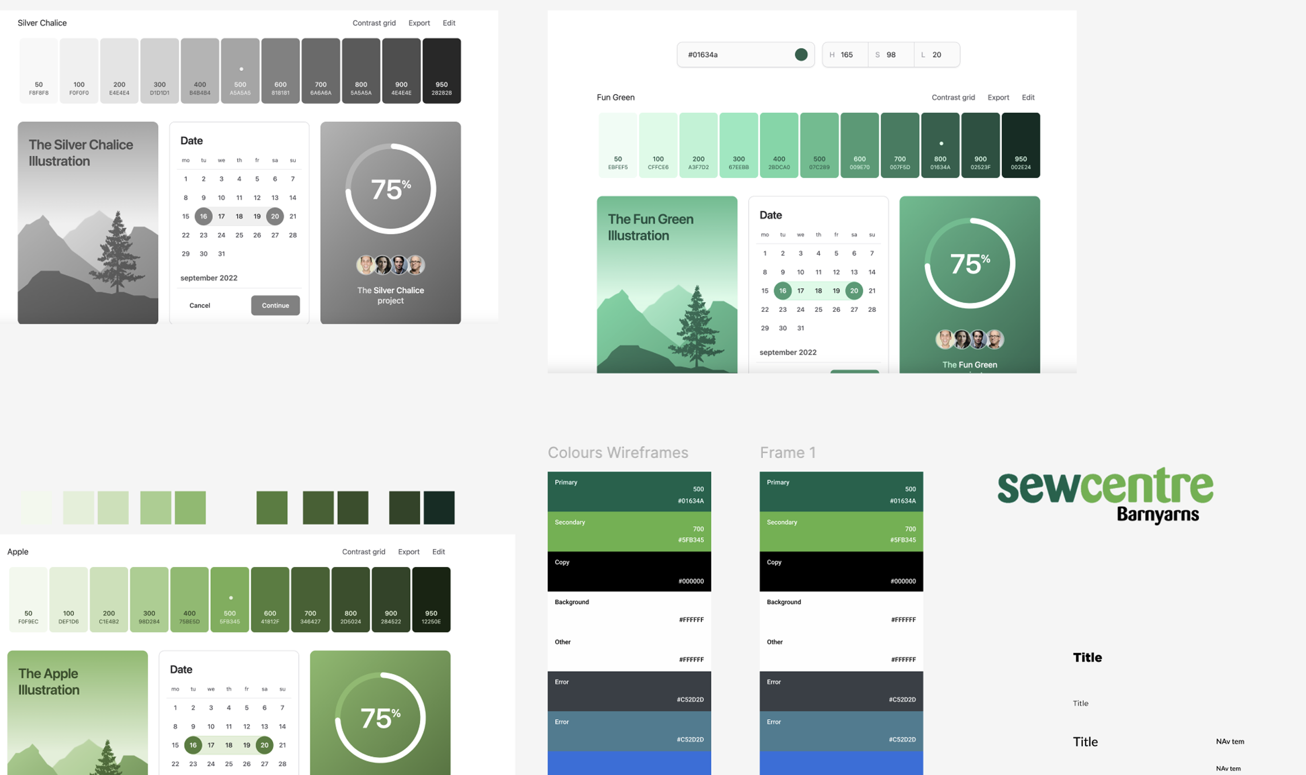
After selecting a layout, I created a colour palette and swatches based on the branding and applied them to the draft components to see how they would look and ensure proper contrast for accessibility. I chose the primary green colours from the branding and used variations of black for other elements.
I created a small design system that included typography, colours, and common components for consistency and ease of use for the developer.
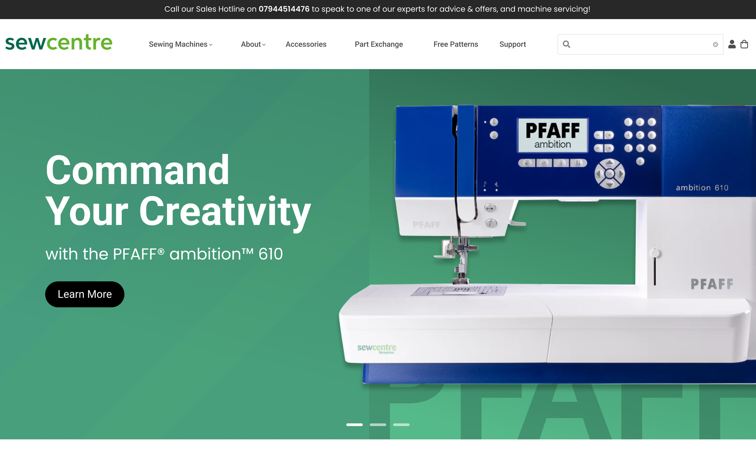
Next, I designed variations of hero images, internal promotional ads, and layout ideas. The developer and I then discussed these with the client to get their approval and make any necessary changes.
Outcome
[videojs_video url=”https://www.gd86.co.uk/wp-content/uploads/2024/04/sew_outcome.mov” autoplay=”true” controls=”true” loop=”true”]
We successfully delivered a website with intuitive navigation, enabling users to easily locate products and services. Using Shopify as a base, we created a bespoke theme that allowed the client to change the design, to allow them to showcase products and promotional content effectively.
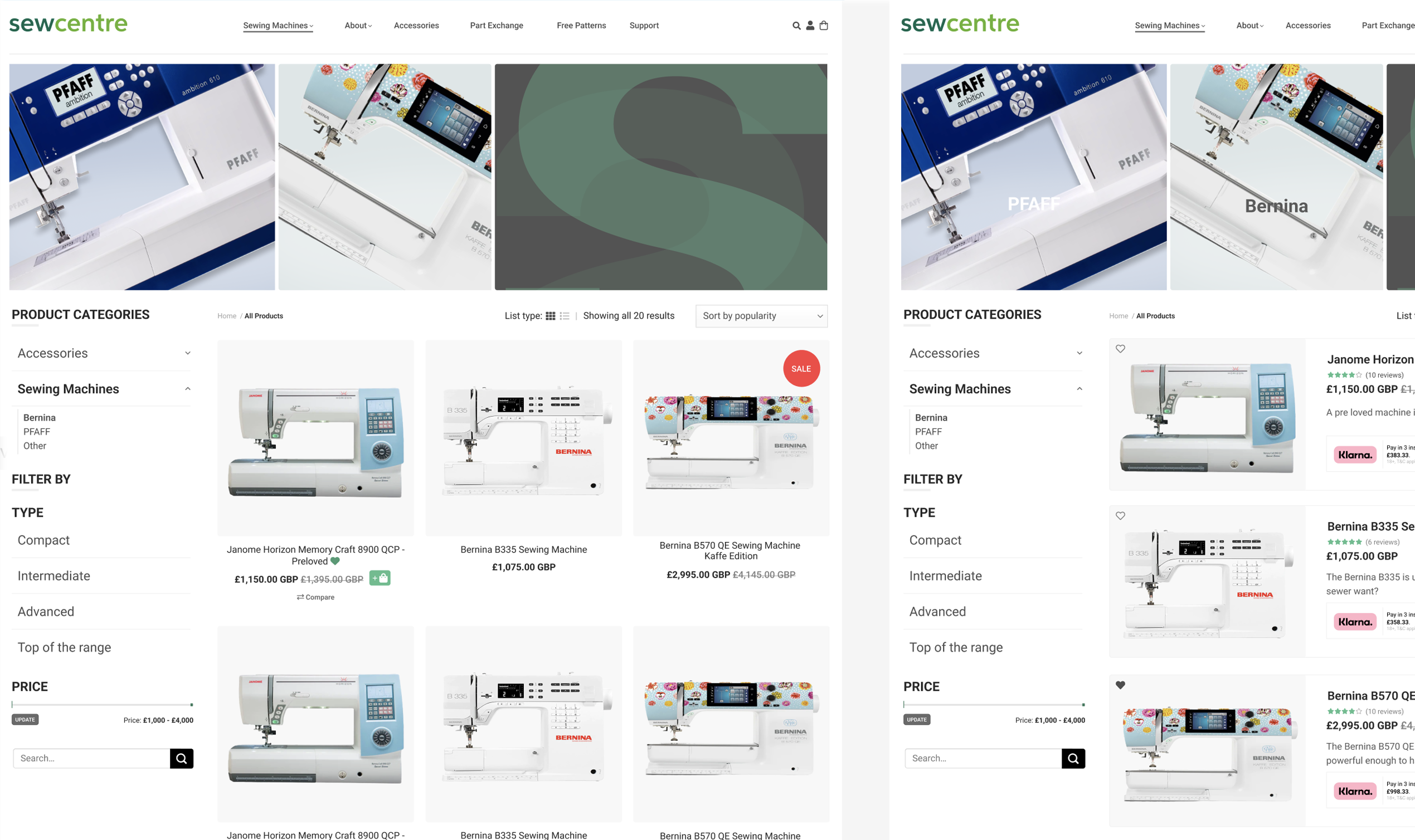
I designed layout ideas with images, badges, and components to improve user engagement and accessibility. These layouts guided the developer, and we collaborated on final tweaks to ensure we delivered my vision.
After launching the website, we saw increased customer interaction, higher page views, and boosted sales.
Next, I’d like to conduct a UX audit to analyse funnel data and session recordings. This will guide future user interviews and help us present evidence-based UX improvements to the client.