Rebrand and website revamp for an optician..
- Scope: Website Design
- Role: Concept & Visual Identity
- Tools: Photoshop & Illustrator
- Collaborators: Branding Team

Cloughs Branding.
Brief
Cloughs, an optician based in Bolton, England, enjoys a longstanding reputation in the local community. Seeking to modernize their brand image and website, they approached us for assistance.
Their existing branding was dated, so we conducted thorough research into their brand identity. Collaborating with the branding team, we crafted a brand concept that seamlessly blended modern aesthetics with a touch of vintage charm.
Upon presenting this concept to Cloughs, they liked our current approach and asked us to proceed with designing their new website.
Ideation
[videojs_video url=”https://www.gd86.co.uk/wp-content/uploads/2024/04/hero_concepts.mov” autoplay=”true” controls=”true” loop=”true”]
Cloughs wanted us to highlight the contact number and appointment scheduling CTA on their new website. They wanted the hero section to direct visitors to specific pages and showcase their products and services across other pages.
I designed the layout and explored navigation options like hamburger menus and traditional top-level navigation. Using stock imagery, I illustrated hero section ideas and created page concepts. These visuals guided development and helped Cloughs visualise what content they needed to create.
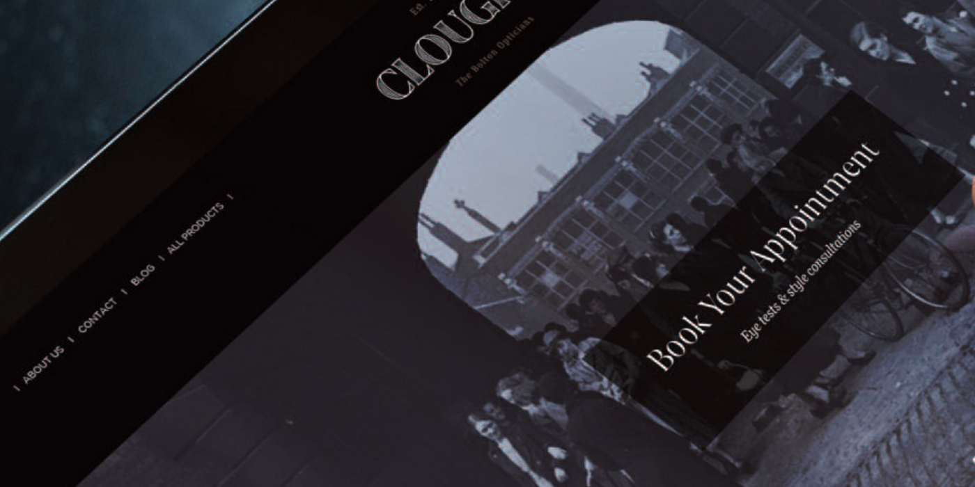
Outcome
[videojs_video url=”https://www.gd86.co.uk/wp-content/uploads/2024/04/cloughs_web.mov” autoplay=”true” controls=”true” loop=”true”]
We successfully created a website that combines a clean, modern appearance with a warm, vintage feel. The design utilises content blocks to guide users’ attention towards specific elements on each page.
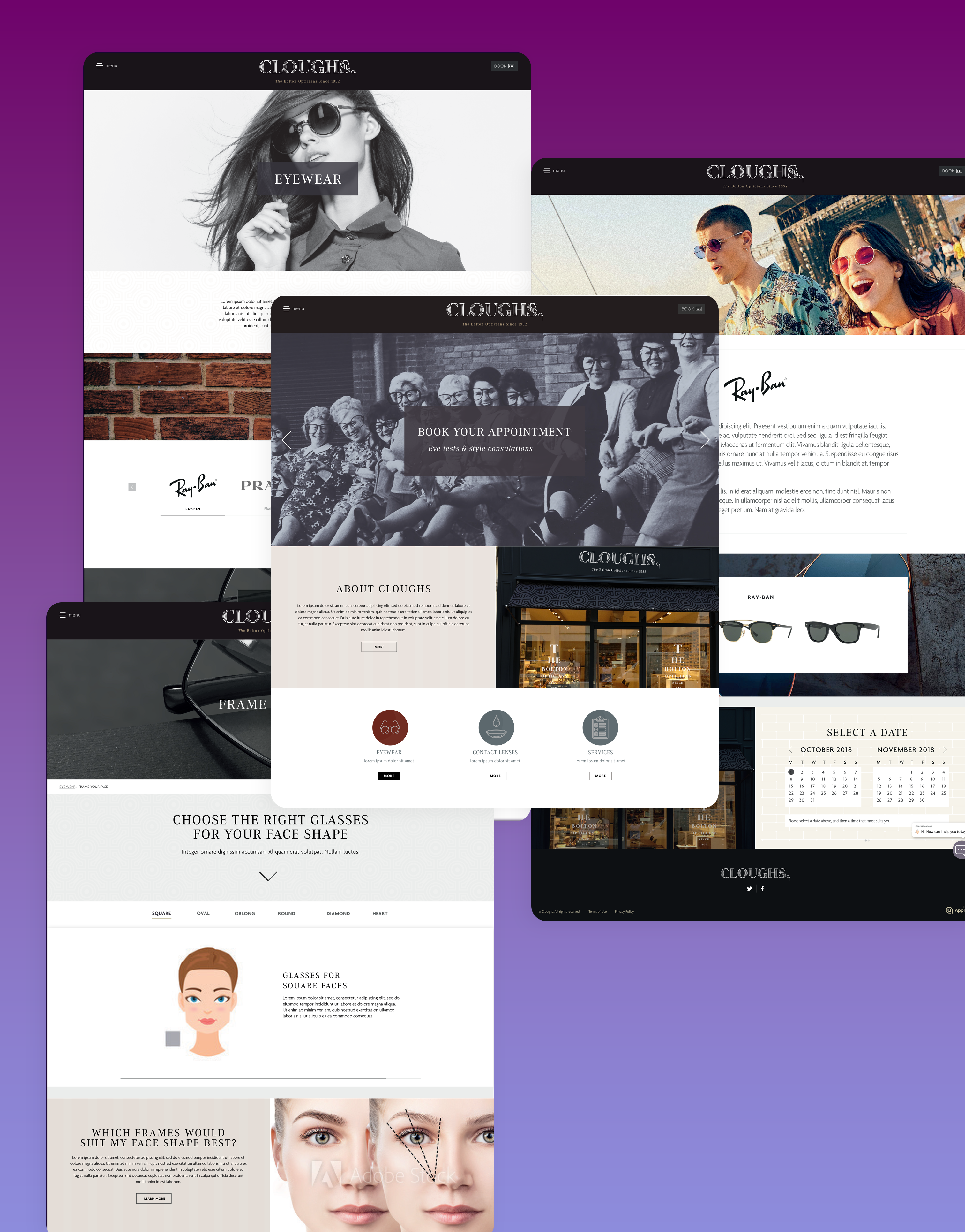
We maintained consistent styling throughout the website to ensure a familiar user experience. Customers can easily book appointments and find contact information from any page, as requested by the client.
Varied image styles and illustrations help break up the design, keeping users engaged throughout the site.
The client was pleased with the outcome, and they noticed an increase in appointments since the website’s launch.