Marketing and business materials.
- Tools: InDesign, Illustrator & Photoshop
- Collaborators: Marketing & Board Members

Promotional material for Lisuto.
Overview
As Lisuto’s sole designer, I created promotional materials ranging from web content to traditional items like bilingual business cards and marketing leaflets in English and Japanese for our global teams.
Business Cards
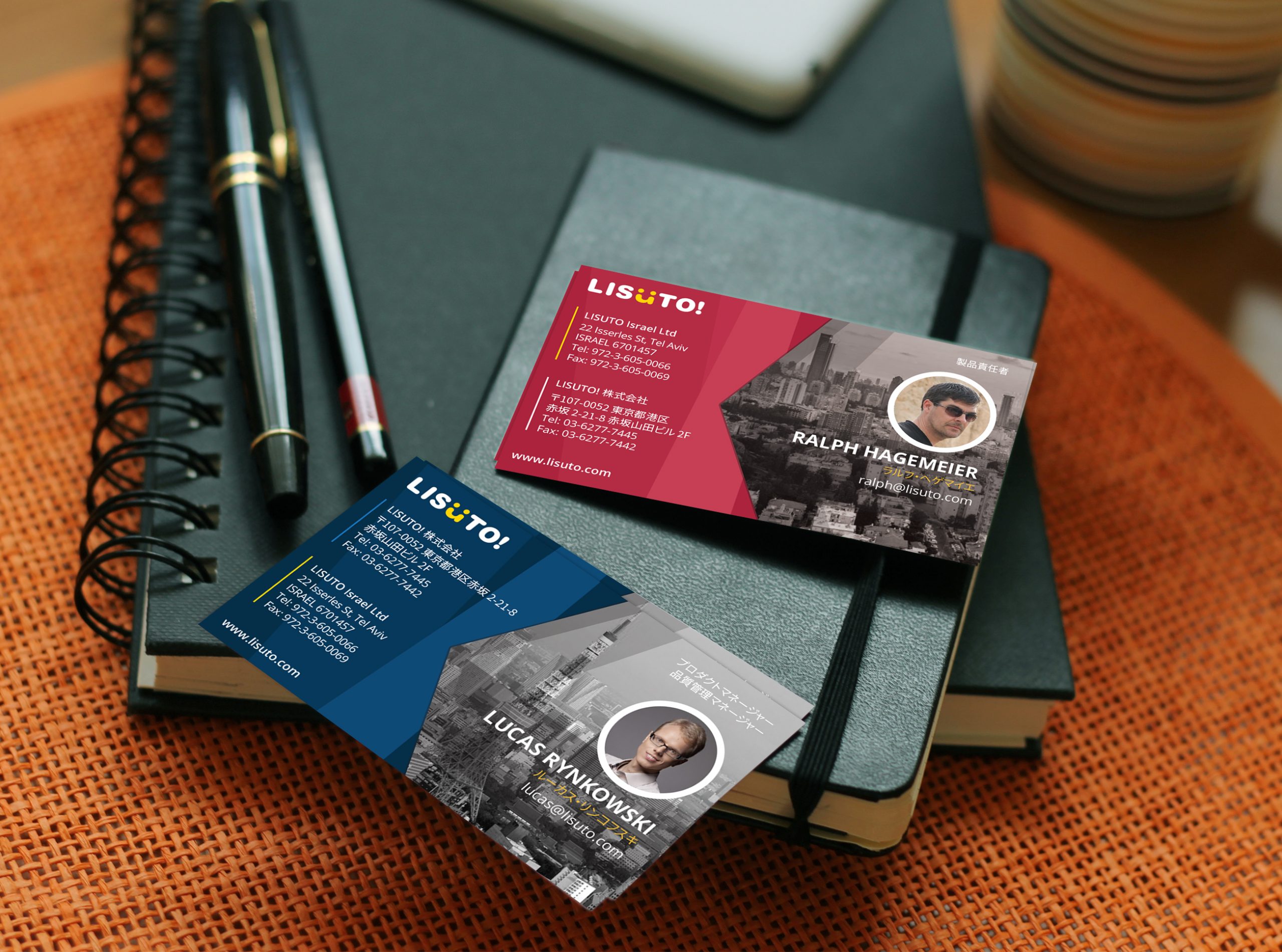
Business cards (meishi) are highly valued in Japanese business culture as they represent the first impression of you and your company. To cultivate a cohesive company culture, a business initiative was launched to provide cards for all team members.
I explored numerous variations and concepts for the business cards, experimenting with both portrait and landscape layouts. The challenge was to condense a significant amount of information into a limited space. My maintain focus on highlighting the company logo and the cardholder’s details.
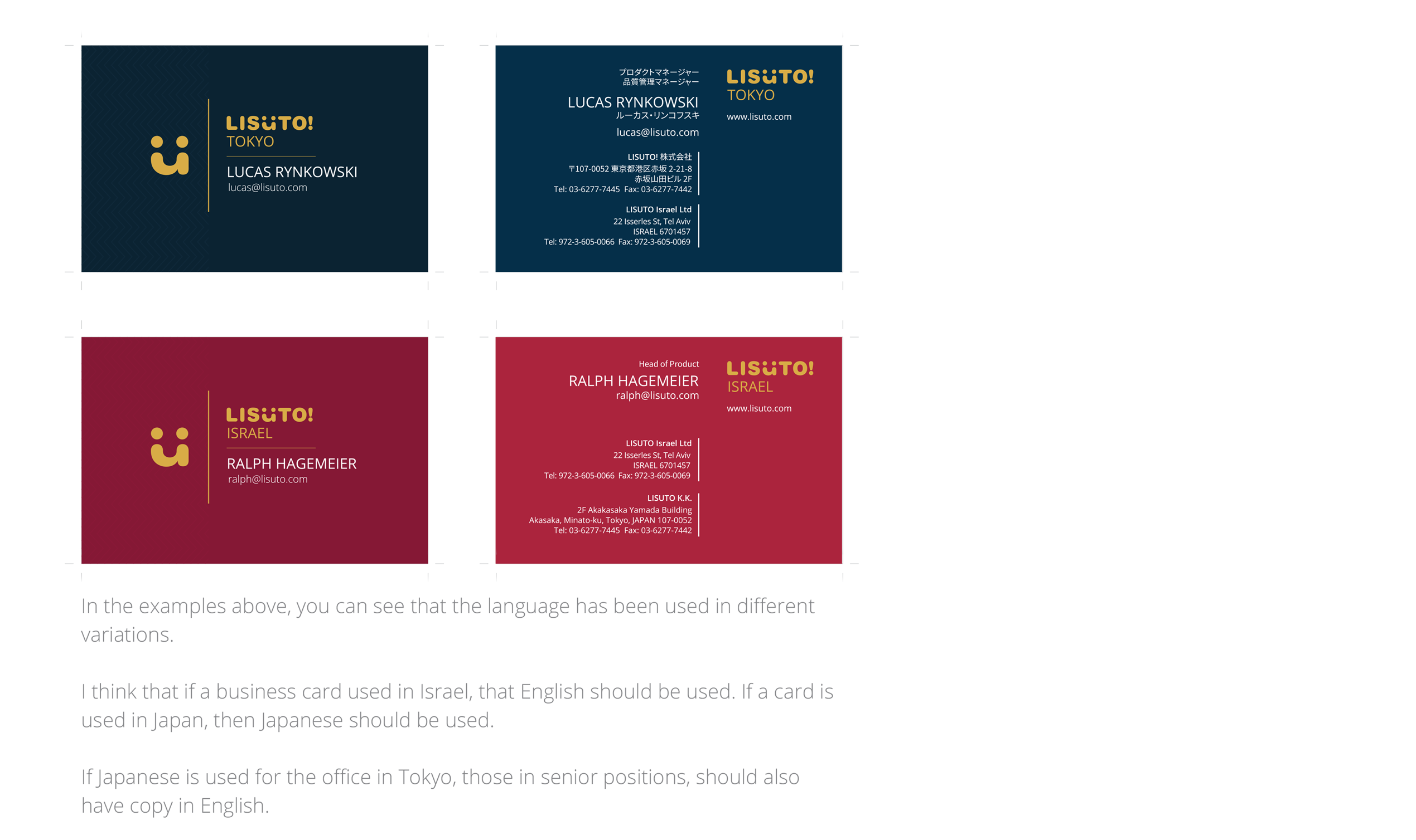
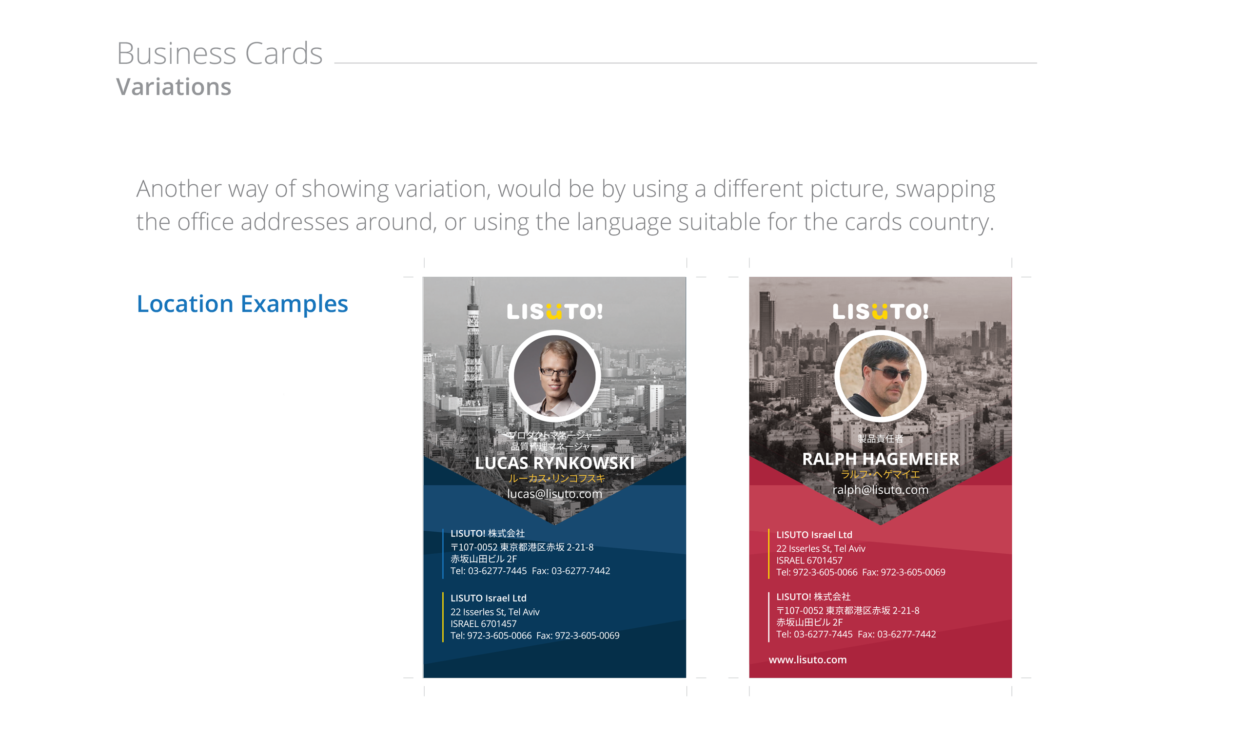
I narrowed down the concepts and presented them to stakeholders and the board, proposing the localisation of card content based on the employee’s office location. For senior positions and those who travel between offices, I suggested having cards in both languages.
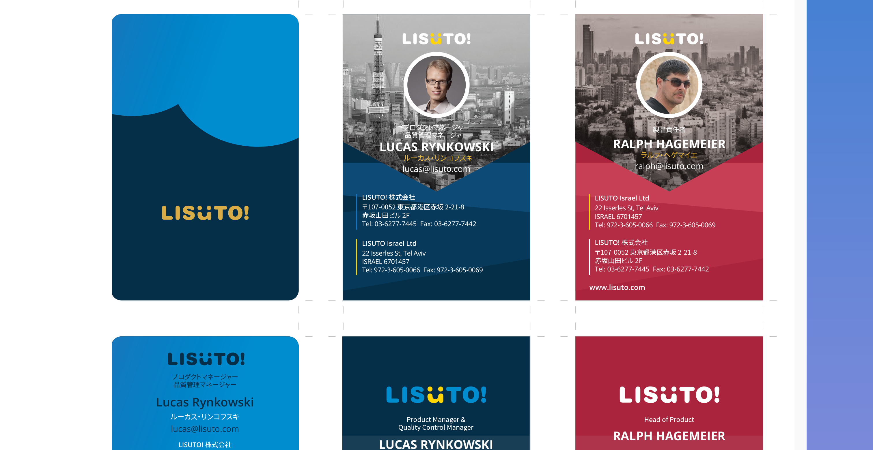
This led to my final choice of business cards.
I considered using different backgrounds to distinguish between offices and helping clients differentiate team members during meetings.
Both minimalist and personalised concepts appealed to me. I also researched print finishes, enhancing the card’s appeal with a spot varnish on the logo for a stronger first impression.
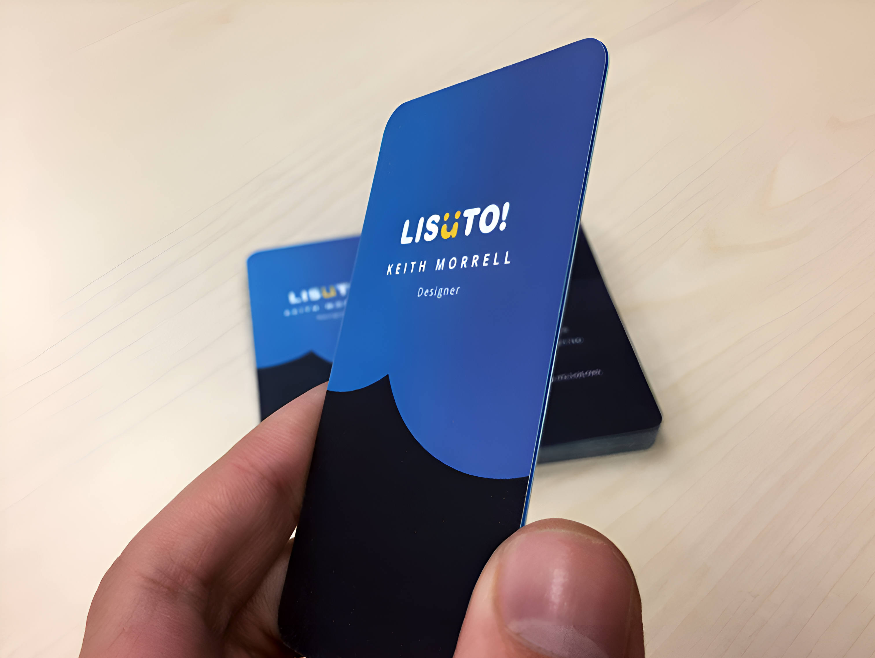
The final business card design prominently displayed the logo on one side, with the person’s name and title for easy readability. We chose duplex cards to give the cards a luxurious feel, using thicker card with a light blue or yellow middle layer. The reverse side included the person’s name, title, and contact details. To save costs, we opted for single-color printing.
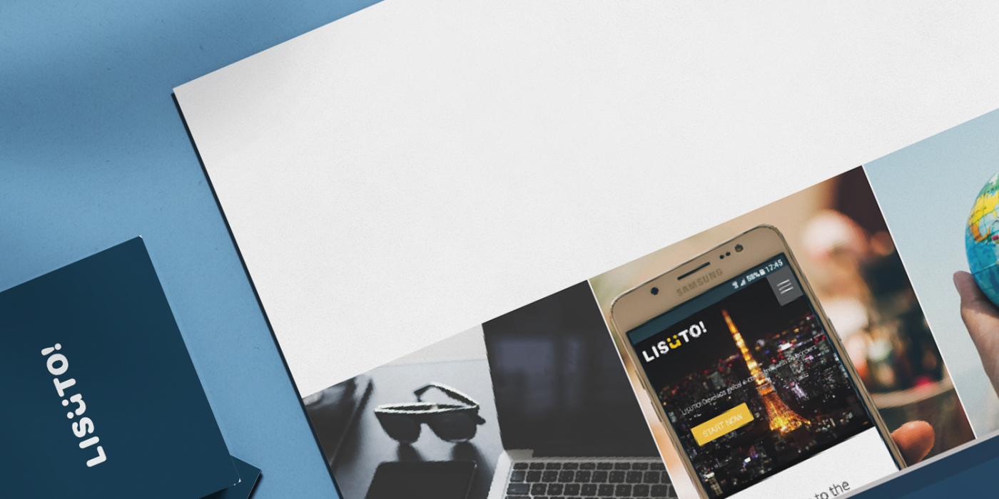
Marketing Leaflet
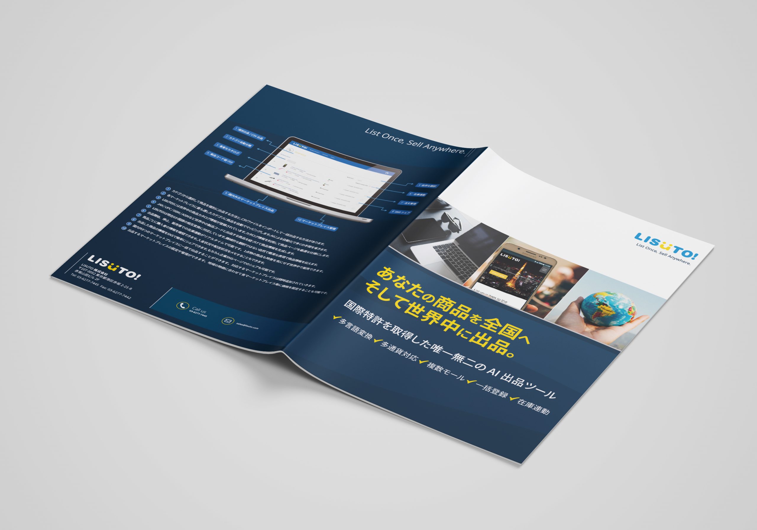
Our marketing department requested a promotional leaflet highlighting key features and services in Japanese.
I designed the leaflet using brand-consistent colours and a mix of lifestyle and branded imagery.
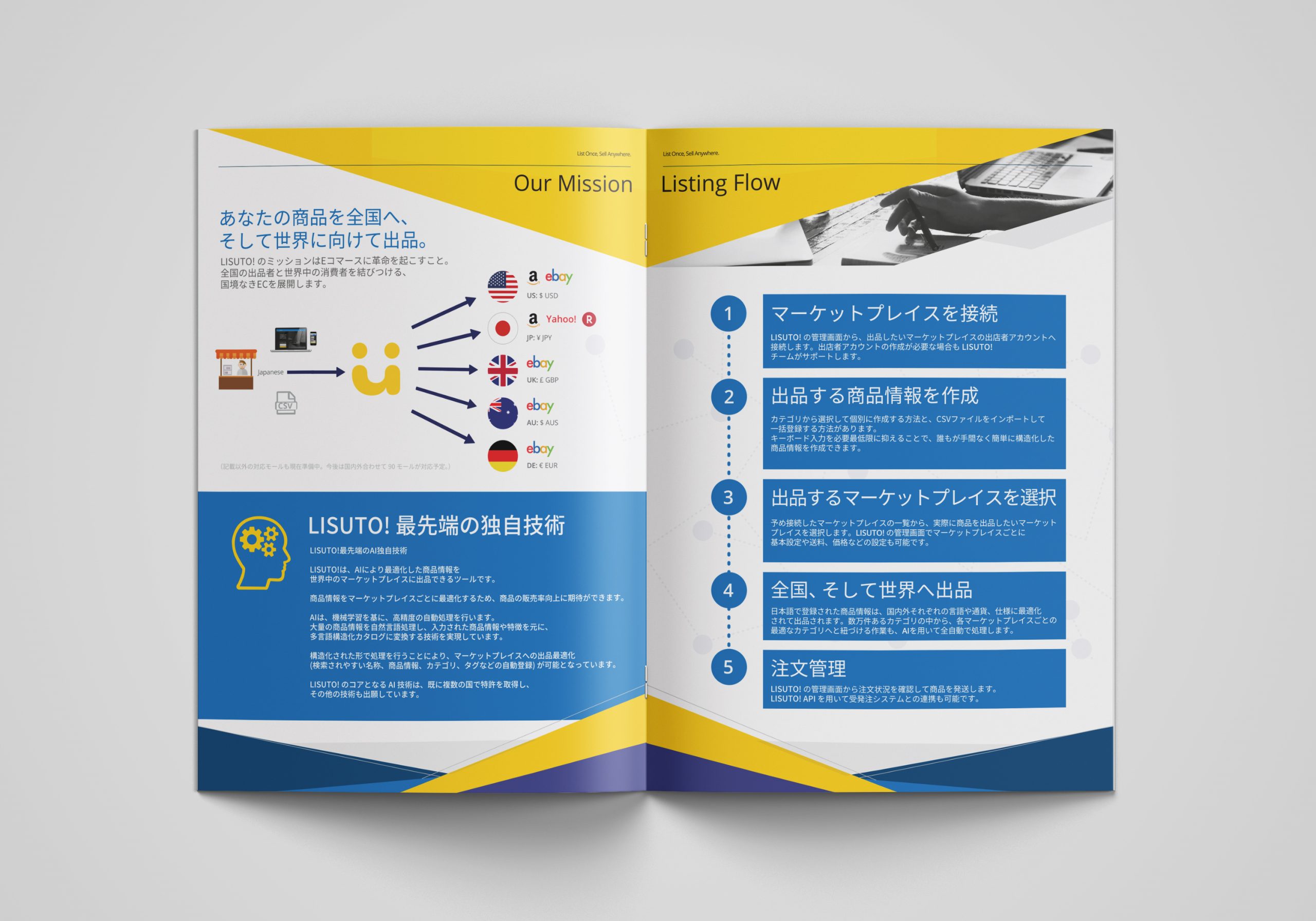
For the inside of the leaflet, I used illustrations, imagery, and typography hierarchy to highlight key points and guide the reader’s focus from left to right.
The copy was provided by the Marketing Manager, with whom I collaborated to ensure the content flowed smoothly and read correctly.
The leaflet, along with other marketing collateral and stationery I created, enhanced our brand image and helped attract more clients. The marketing materials provided a strong first impression and initiated client engagement.