Cross-Cultural Logo Design for a Japanese pet import and export specialist
- Scope: New Brand Identity
- Role: Creative Direction, Design Concepts, Research & Visual Identity
- Tools: Photoshop, Illustrator, InDesign & InVision
Website concept Animal Fly.
Overview

Animal Fly, a Japanese pet transportation logistics company, wanted a rebrand to revamp their promotional materials and communicate their services through a new logo and imagery to a global market.
Research & Exploration
The client wanted their new logo to reflect their services and include Japanese elements if possible.
I researched various logos, both Western and Japanese. I explored online examples and offline design resources collected during my frequent trips to Japan. I found that Japanese logos often use symbols to represent objects or letters, inspired by historical crests and hanko (distinctive mark stamps) that incorporate Japanese characters.
Typography
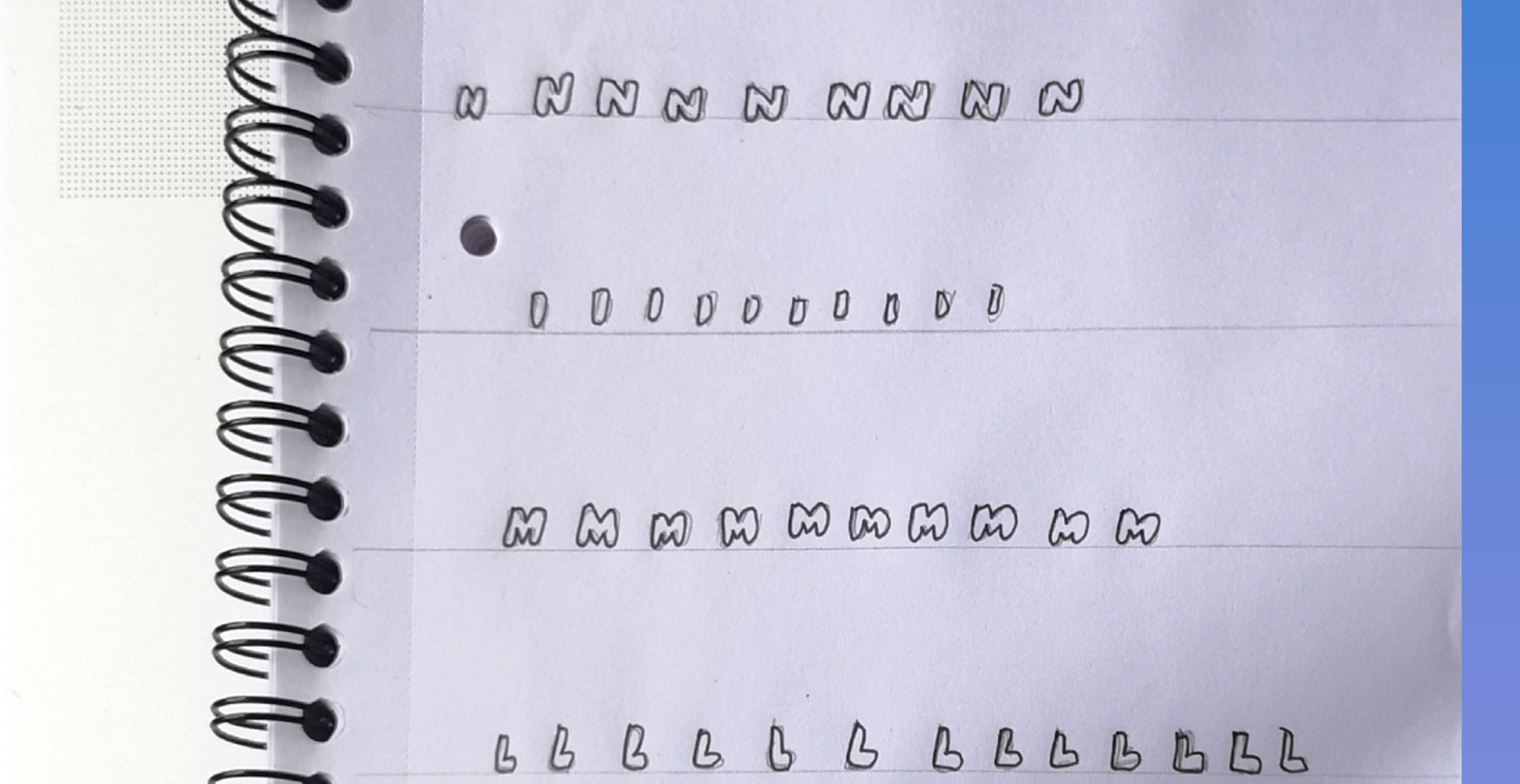
To give the logo a unique and friendly feel, I decided to create a custom font using hand-drawn letters. I began by sketching the letters by hand, then imported and refined them.
Ideation & Narrowing Down
Based on my research, I sketched ideas and refined them in Illustrator. After creating several concepts, I selected a few and gathered feedback from 20 people to understand their preferences and the emotions conveyed by the logos.
Influenced by the previous logo, I chose orange, navy, and grey as the primary colour palette for the new logo to maintain a sense of continuity with the old branding. These colours in my opinion are usually associated with mail, delivery and logistics.
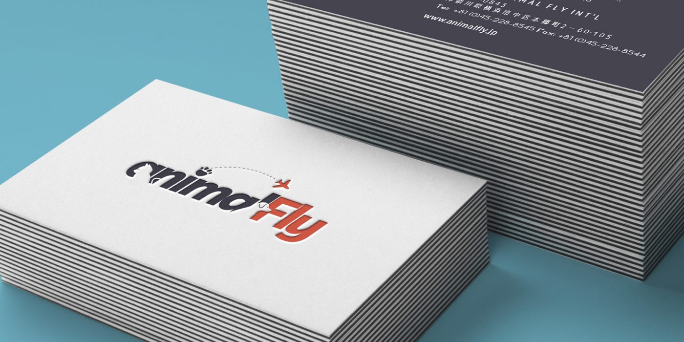
I selected three logos that reflected the company’s services and incorporated its name. The design on the left is more versatile for various mediums, while the others would require separate applications across different media formats.
Outcome
I presented all three logo variations to the client, and they selected the logotype version because they felt it would resonate globally, although they liked all three designs. The final logo is clear and easily understandable for a global audience.
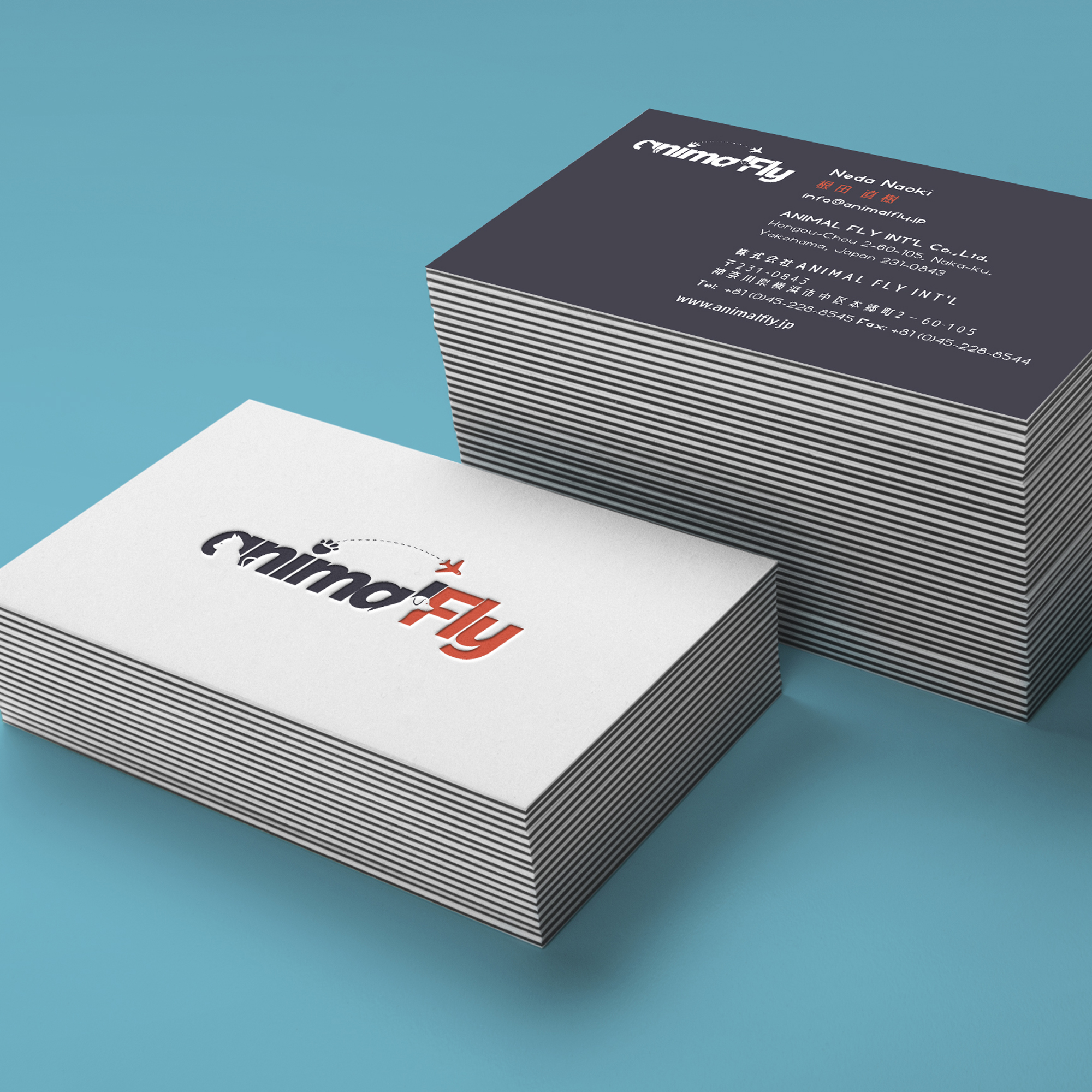
Once the logo was chosen, I was tasked with applying it to new stationery designs and other promotional materials.
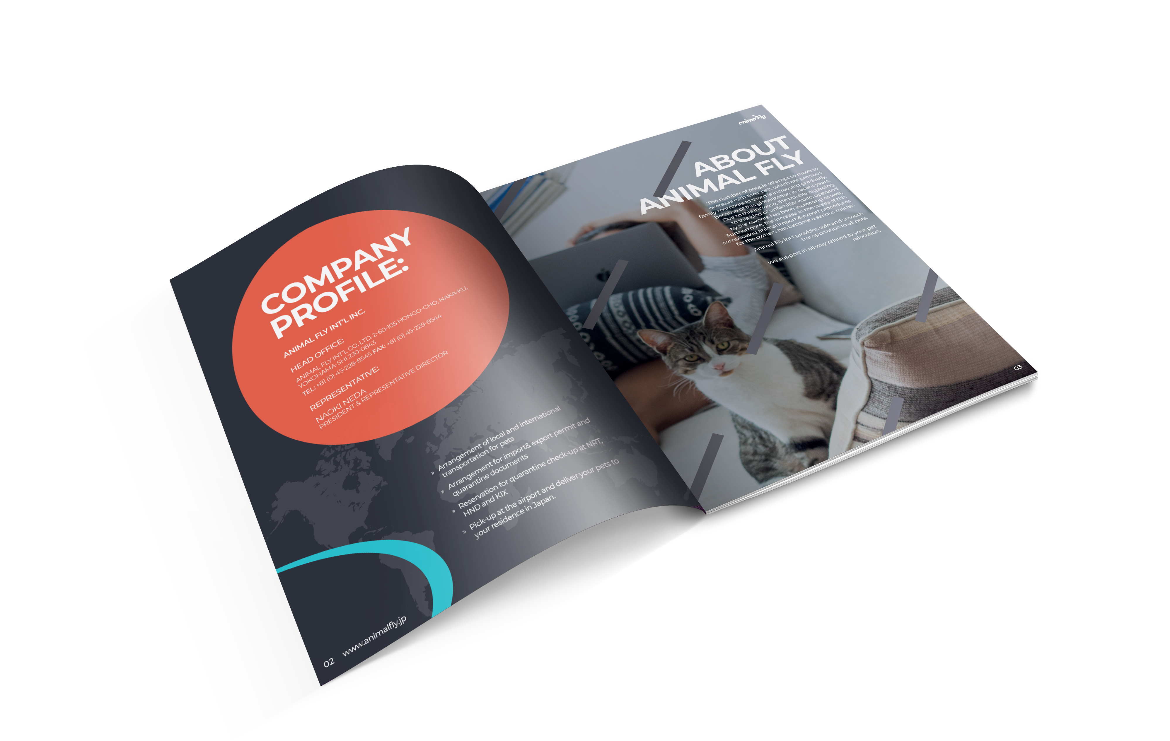
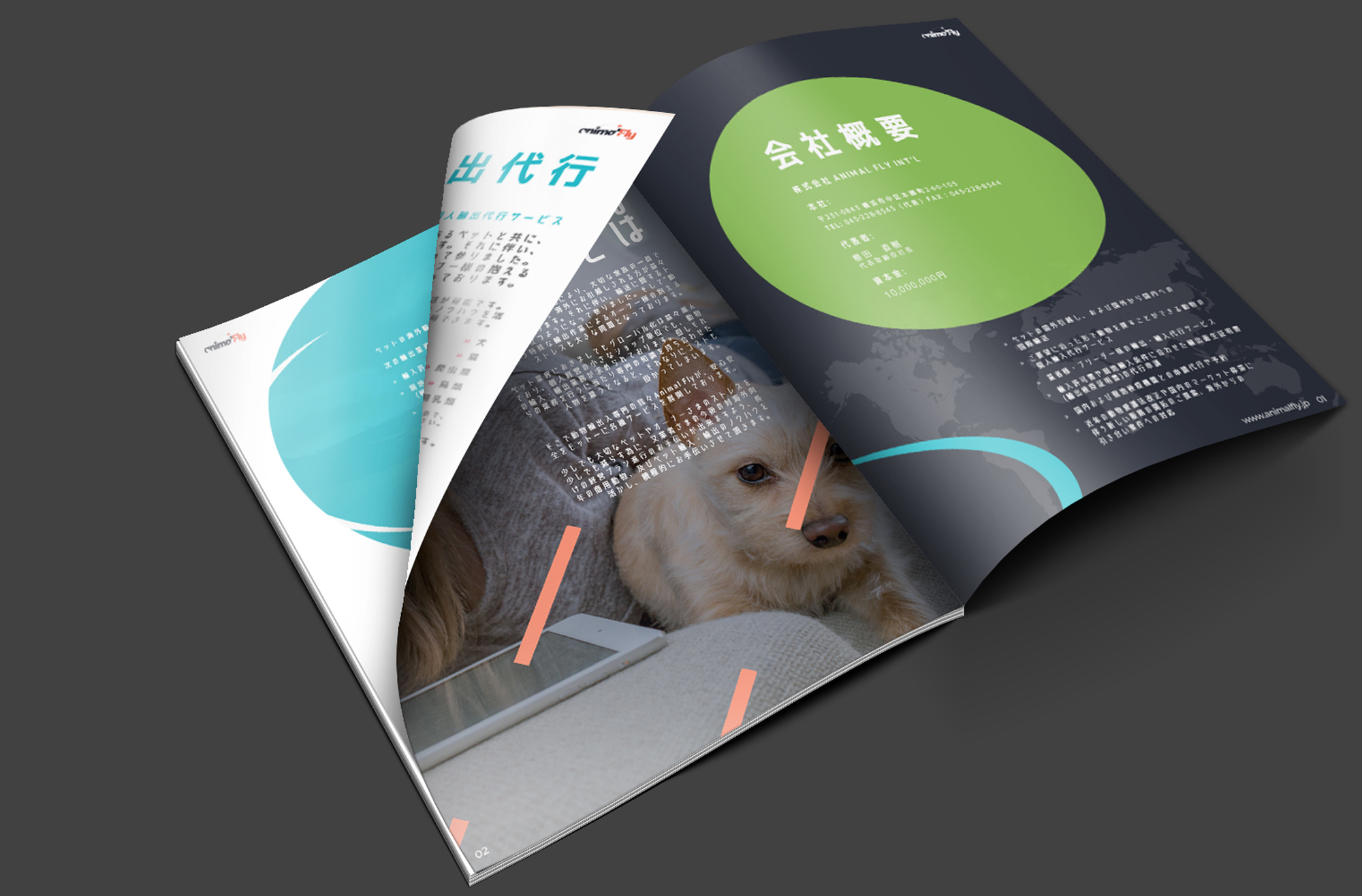
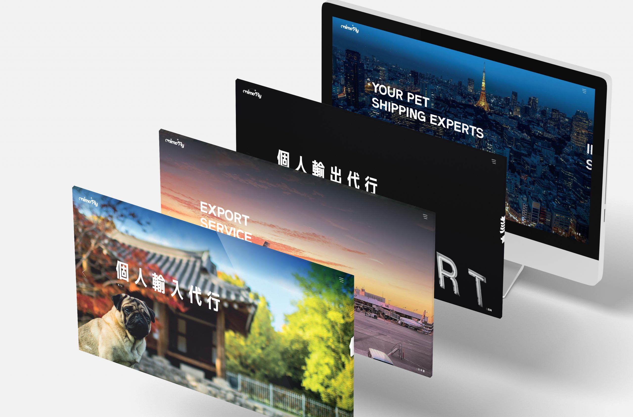
I created brochures and promotional materials for the client in both Japanese and English, using a combination of lifestyle imagery and thoughtful design to highlight the company’s information and services.
Additionally, I developed concepts for the website to mirror the themes and content of the brochures.
[videojs_video url=”https://www.gd86.co.uk/wp-content/uploads/2024/04/af_concept_site.mov” autoplay=”true” controls=”true” loop=”true”]