Infographics, Event & Promotional Materials, and UI Design.
- Tools: Illustrator & Photoshop
- Collaborators: Overseas Manager & Marketing

Japan themed illustration.
Overview
During my time at Lisuto, I worked on projects with varying creative freedom, focusing mainly on developing the web app, which evolved over the two years. I also integrated Japanese cultural elements into designs, such as creating a flyer for internal events featuring items from Japanese summer festivals.
Working in a culturally diverse office allowed me to merge Western cultural norms with Japanese design principles.
Corporate Website Design
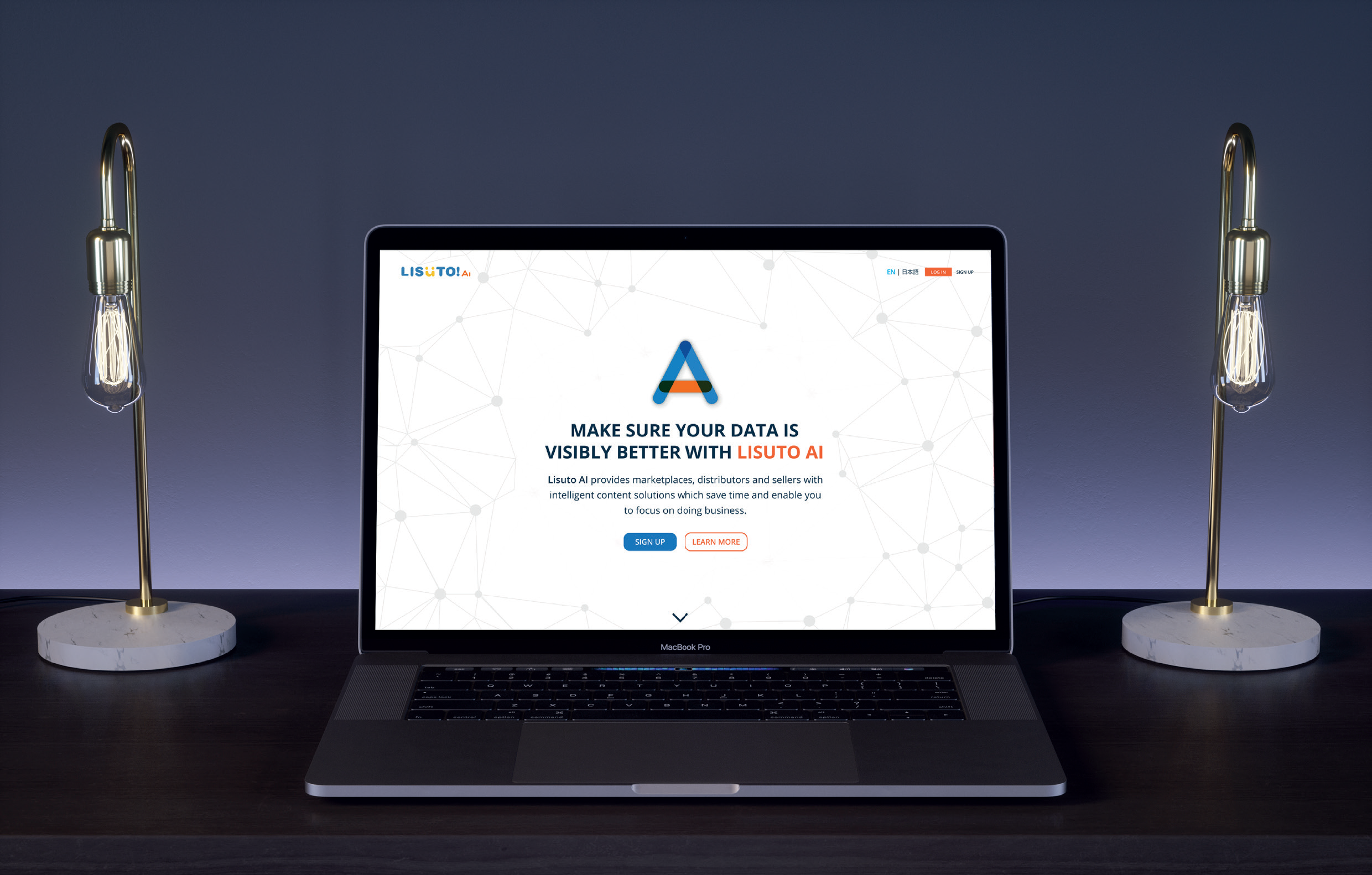
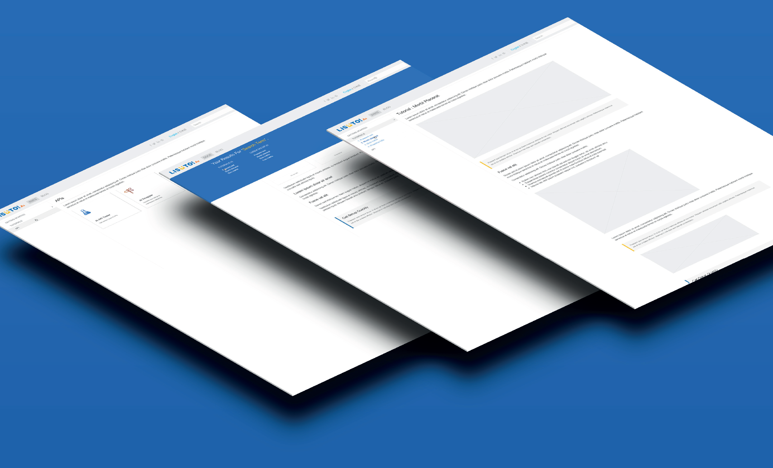
I collaborated with our overseas team on new product introductions. This included a proposed project for a website to promote an AI feature. They created a concept using an online website builder, the concept required alignment with our brand. I was tasked with refining the design by incorporating both existing and new components and styling to ensure it aligned with our brand.
I integrated current design trends and content from the overseas team’s initial concept into the new design update. I noticed some problems with the copy text, so I collaborated with the English and Japanese marketing teams to refine the copy. I also maintained consistent typography and element hierarchy across localised versions, incorporating common components from our main web app to streamline development.
Revamping the Web Application
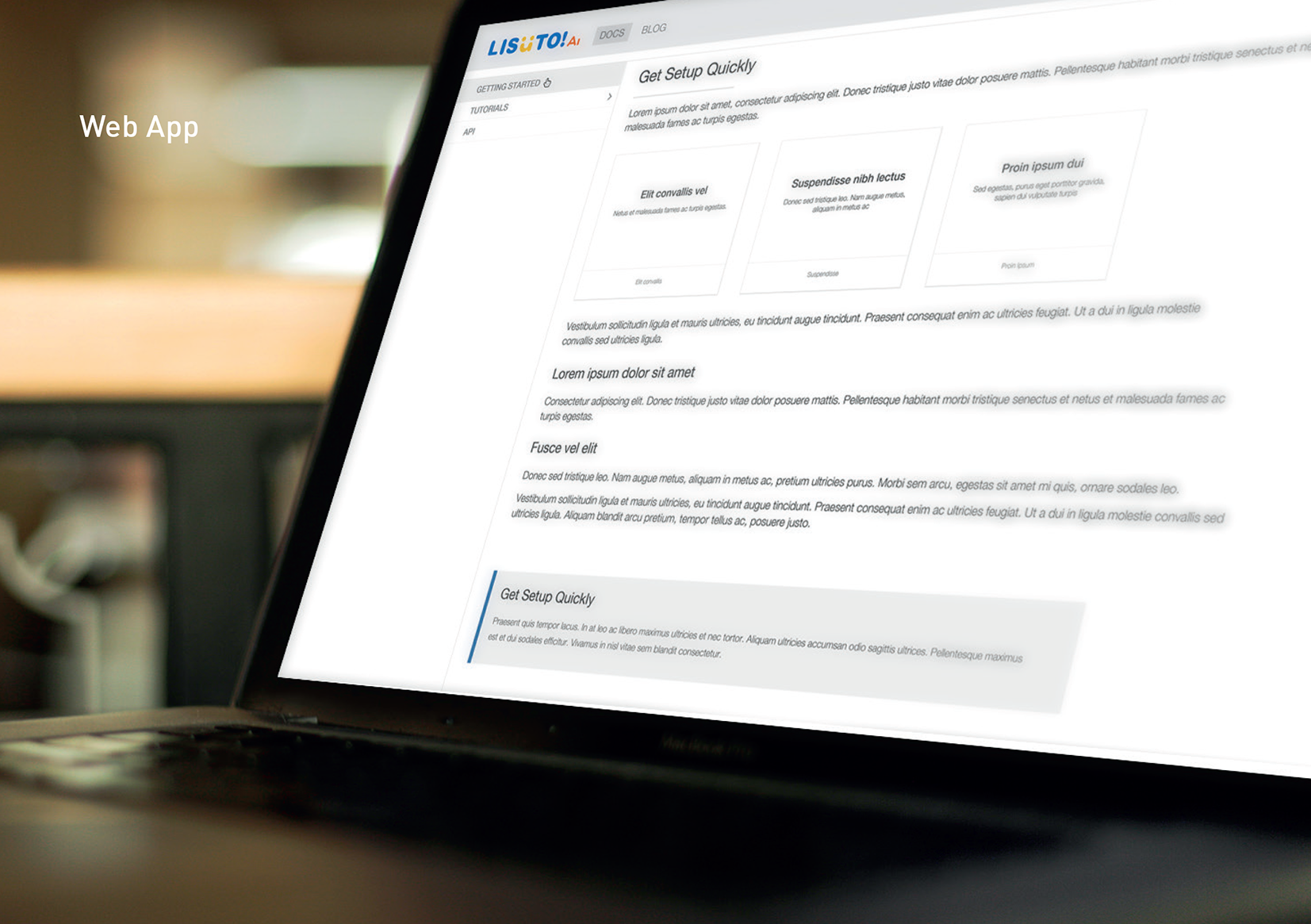
When I joined Lisuto, we were still using the original template created during the rebranding several years before I joined. As the web app evolved with constant updates and new feature requests, our goal was to modernise the layout by enhancing content focus and hierarchy with updated typography and colours. I created a clearer design concept as demonstrated in the onboarding process above and below examples.
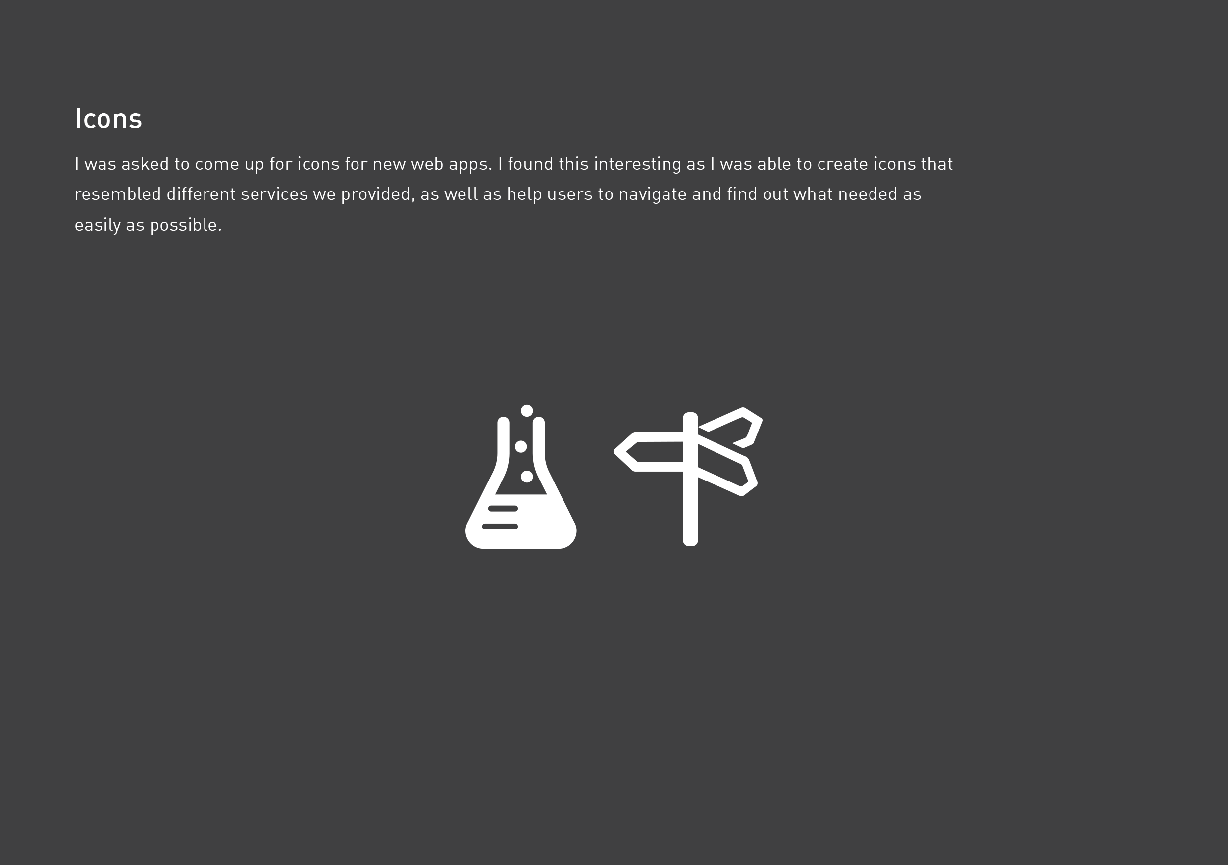
For the revamp, I focused on creating and refining custom icons used across the app and new applications. Given the business’s different categories and services, I designed icons to visually represent each category without requiring a label, but for accessibility, we made sure to include them.
With a variety of design projects, consistency was crucial, and we made sure to adhere to brand guidelines to ensure quality.
I found satisfaction in continually improving designs, and adding creativity where possible to create a more unique experience. Cross-cultural communication was important to ensure our global audience could easily understand and use our services.